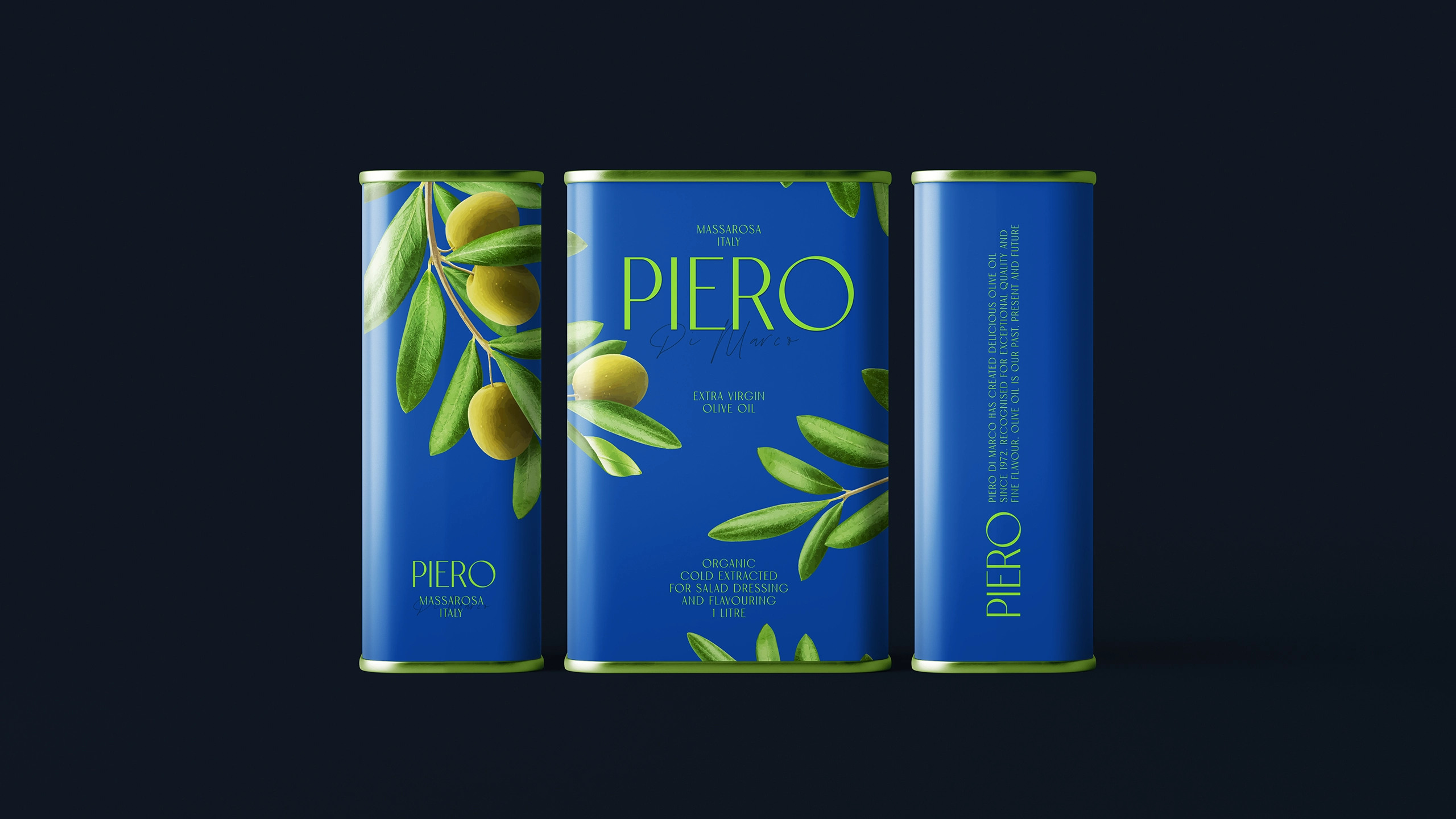
Drawing from
serene essence
of olive farms,
Chídr redefined
PIERO’s
olive oil
packaging,
bringing
a refreshing
cyan that
celebrates
natural purity
and organic
simplicity in
earthy-toned
market.
Background and Execution
In the olive oil industry, packaging often sticks to deep browns and greens to convey richness and authenticity. This has led to a lot of similar-looking products on the shelves, making it hard for any one brand to catch the eye. PIERO, with its focus on natural sourcing and artisanal production, needed a fresh approach that would reflect its core values while standing apart from the competition.
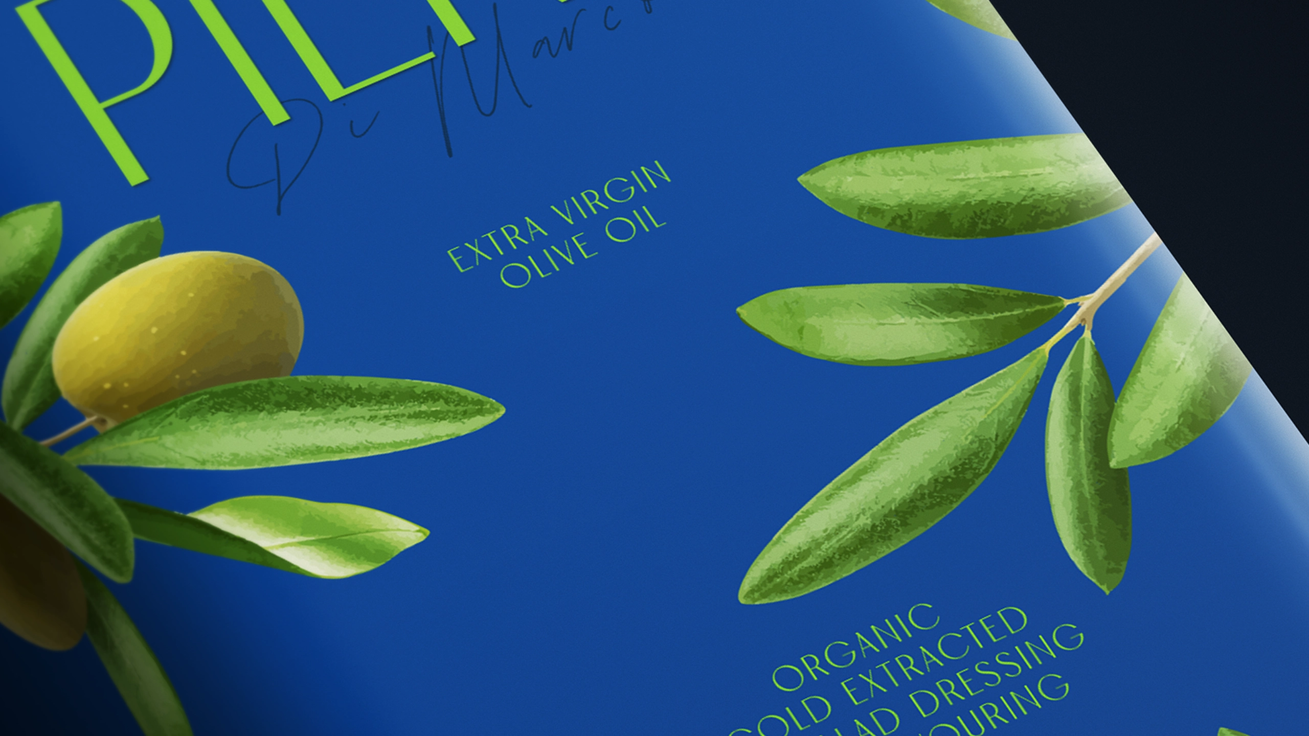
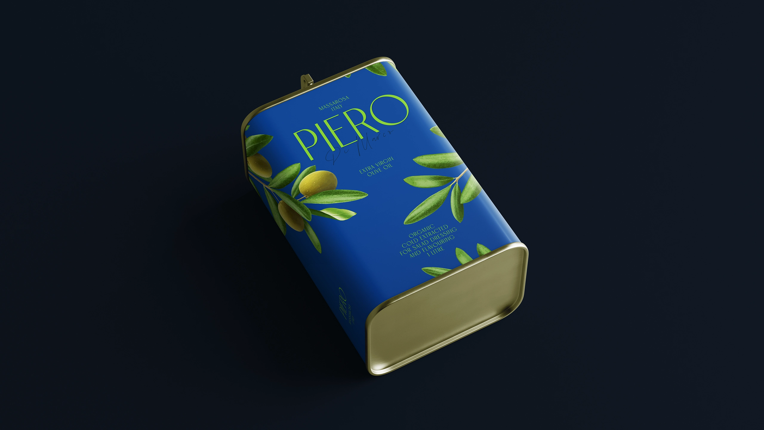
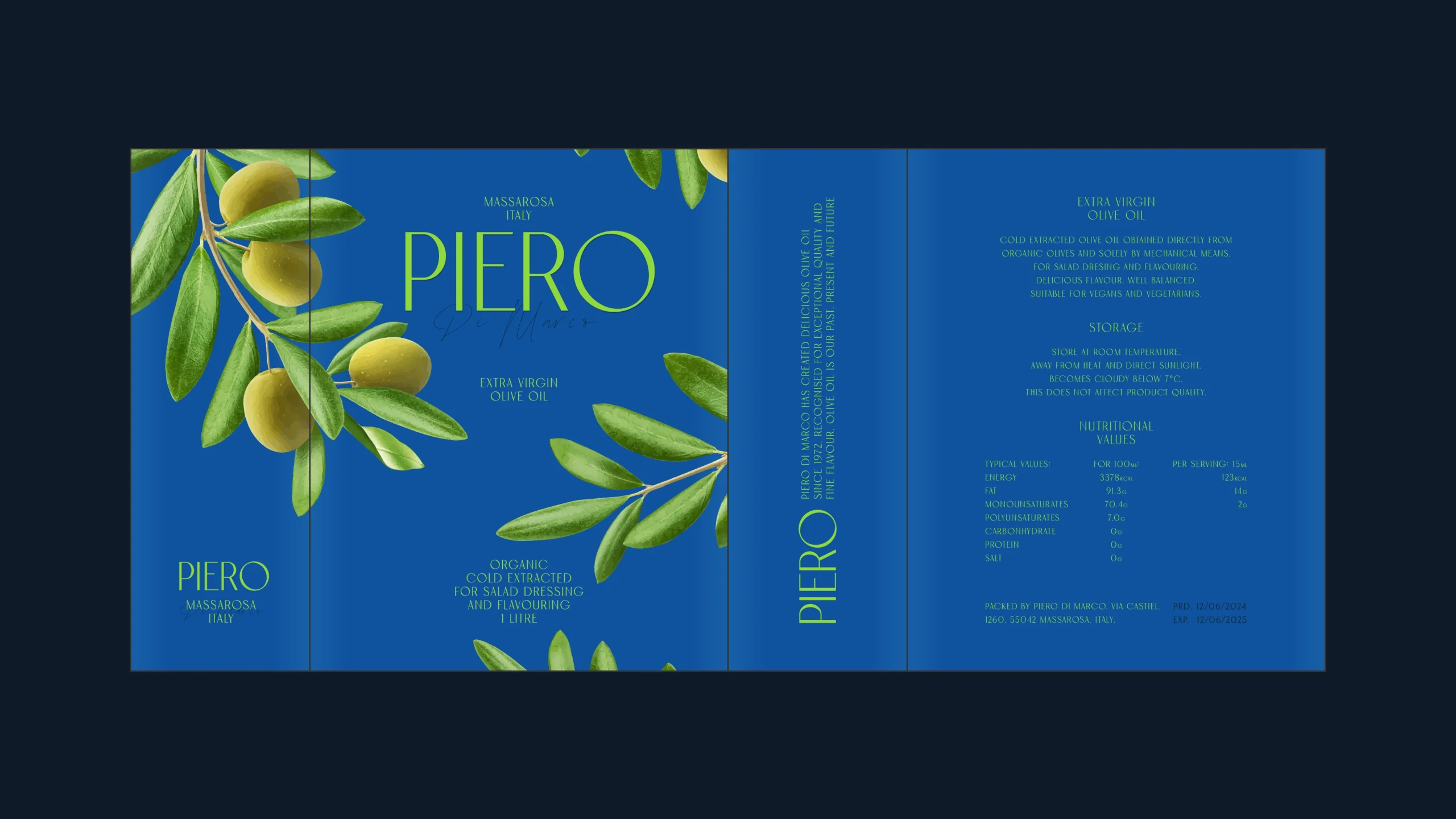
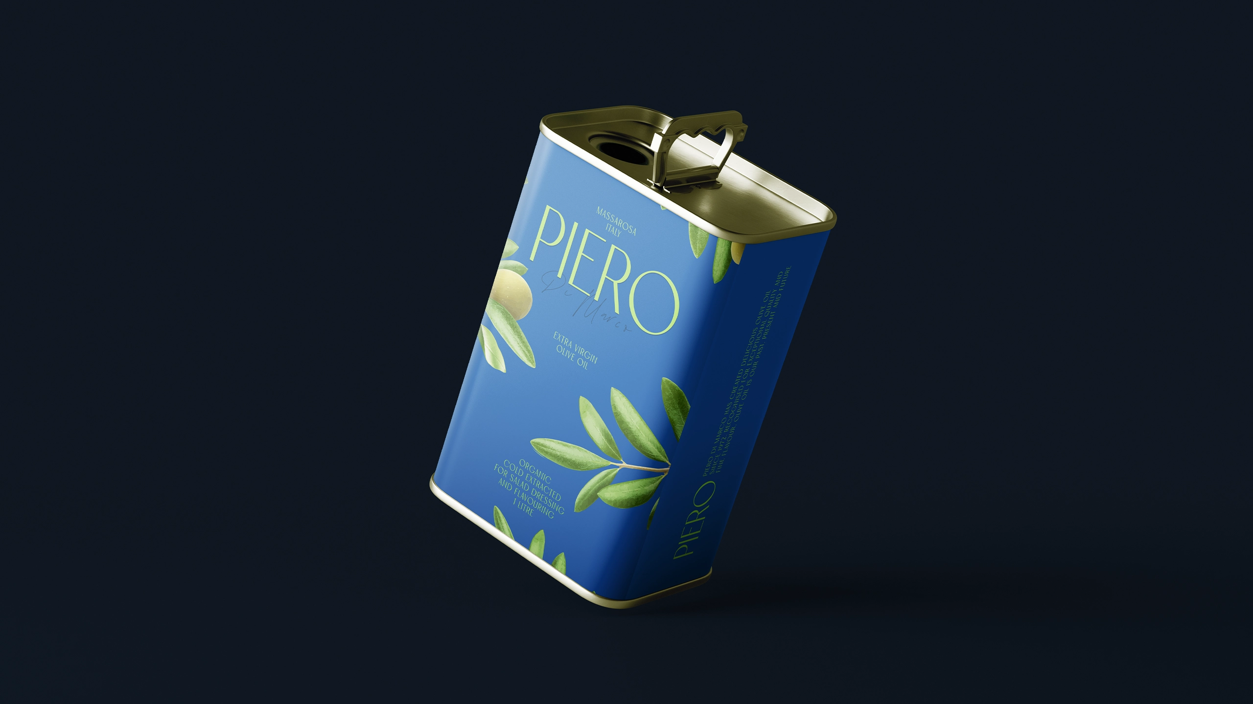
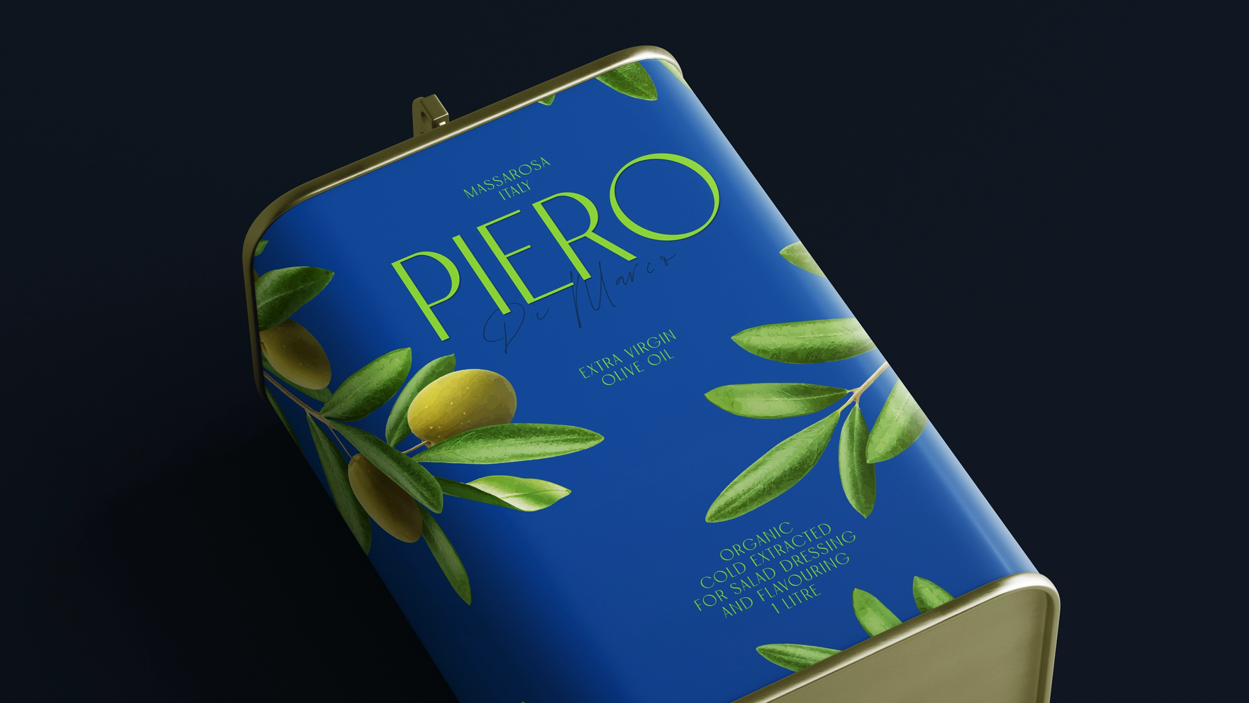
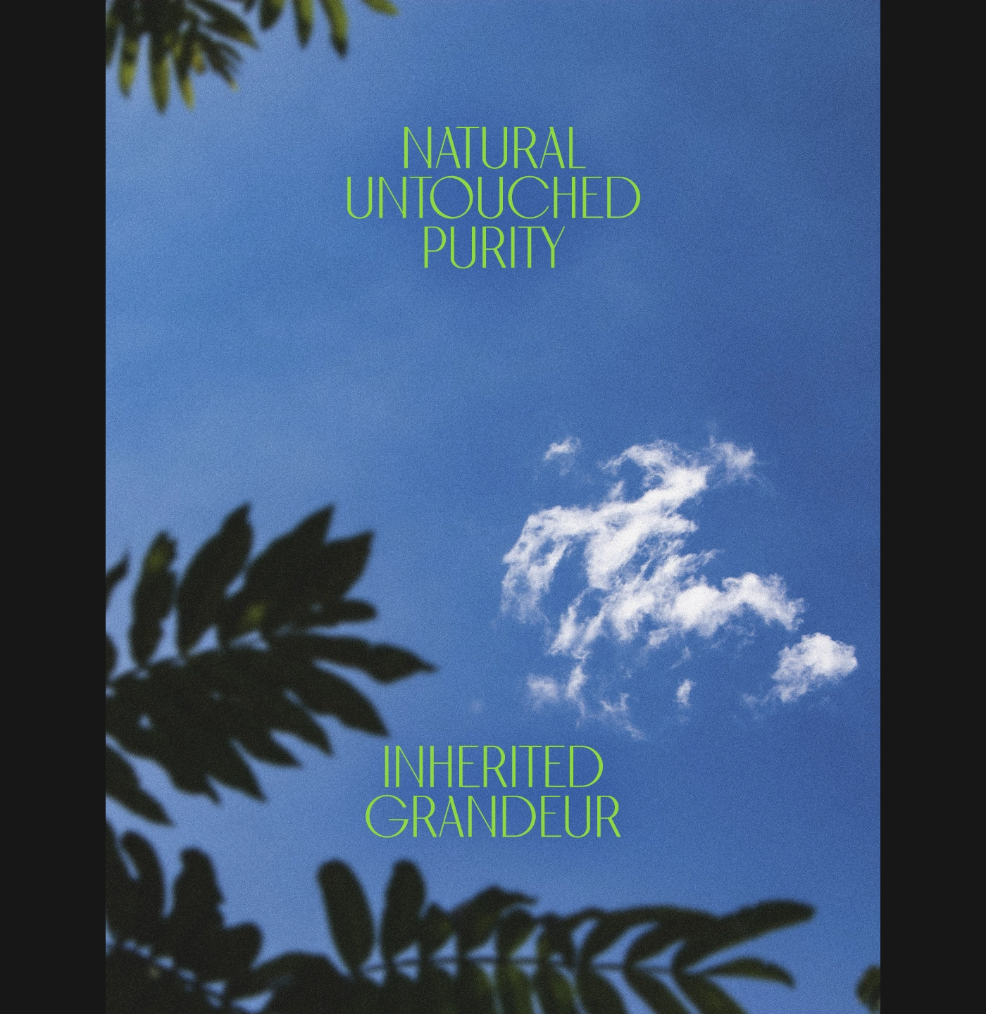
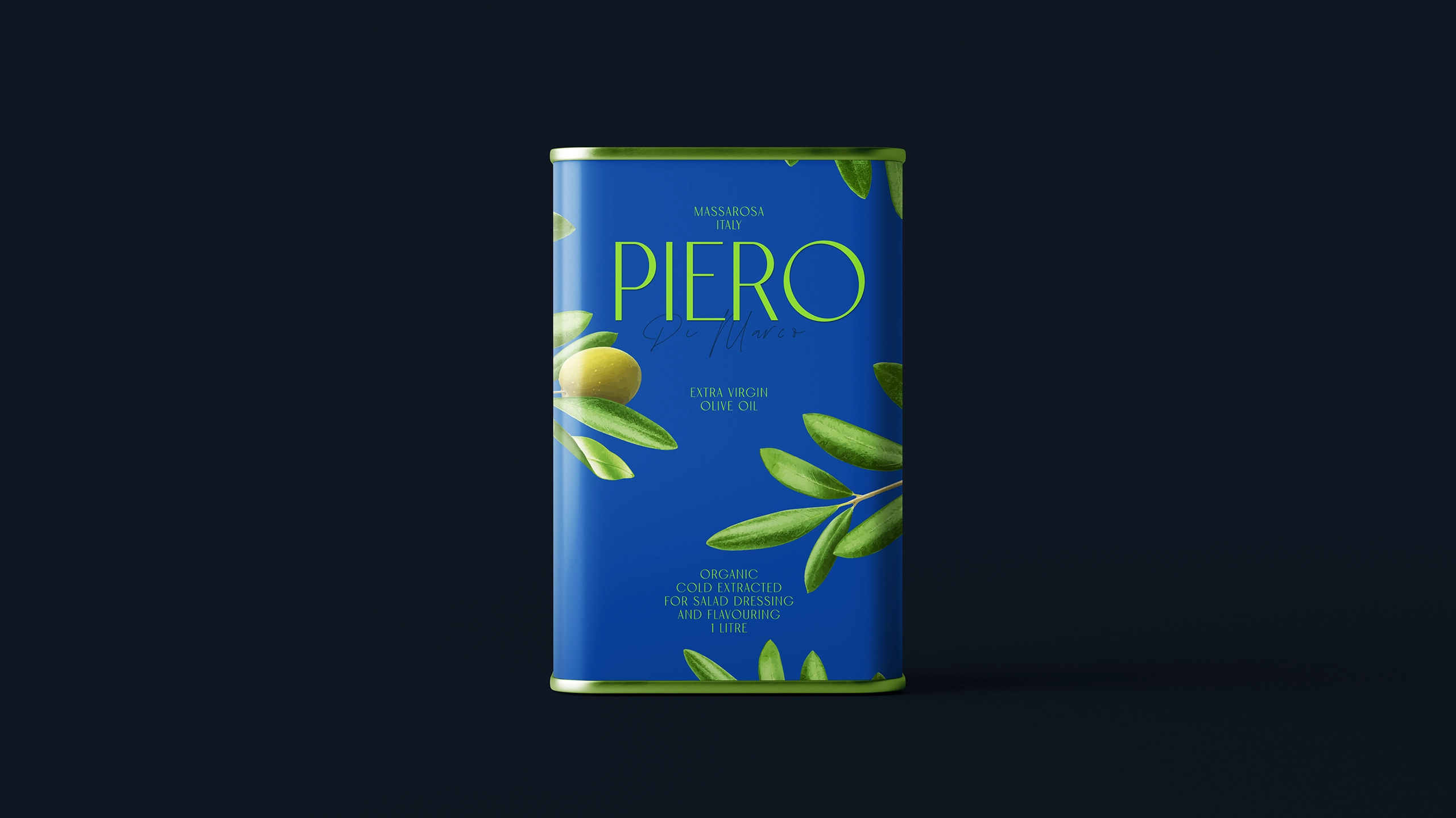
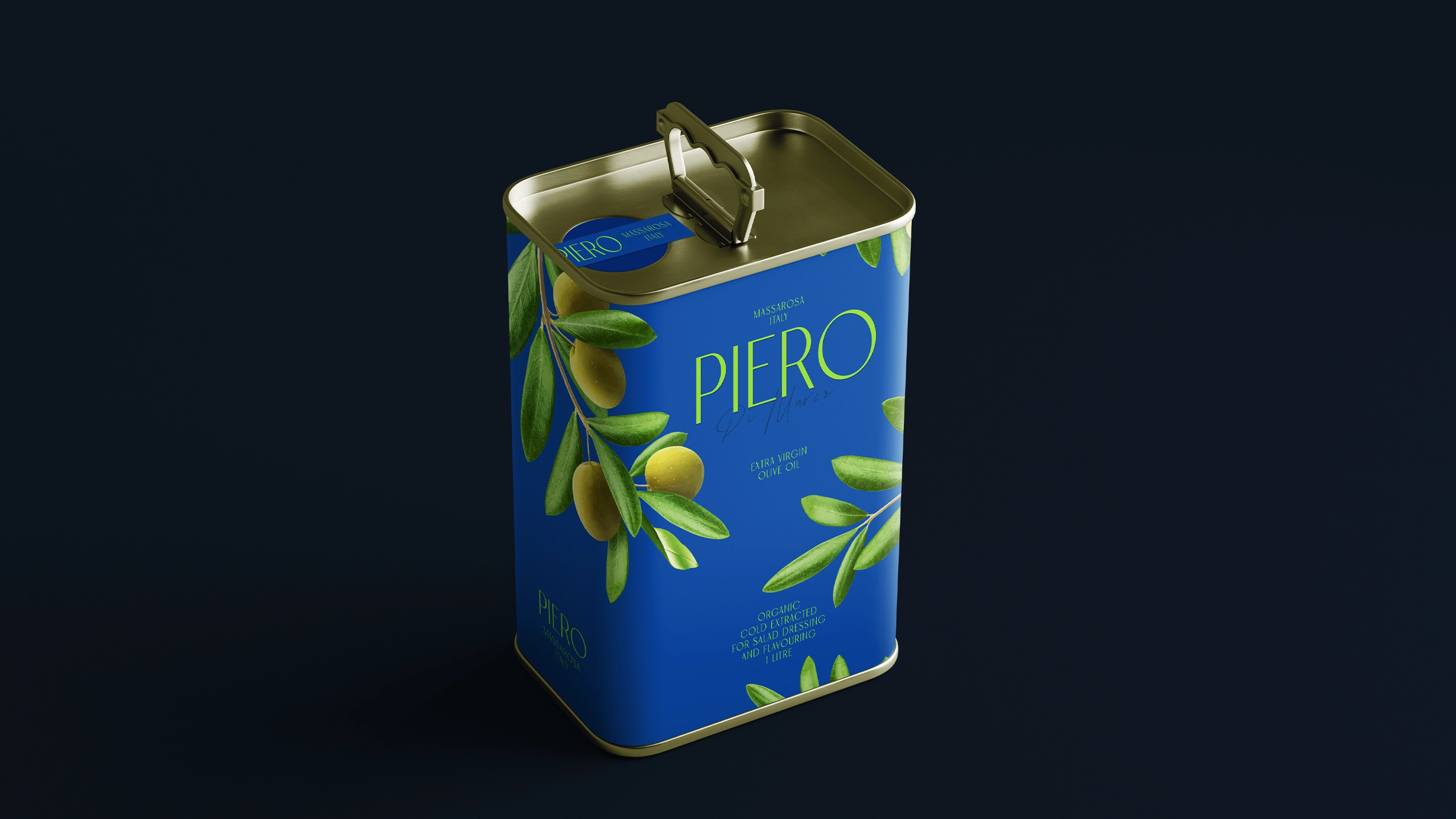
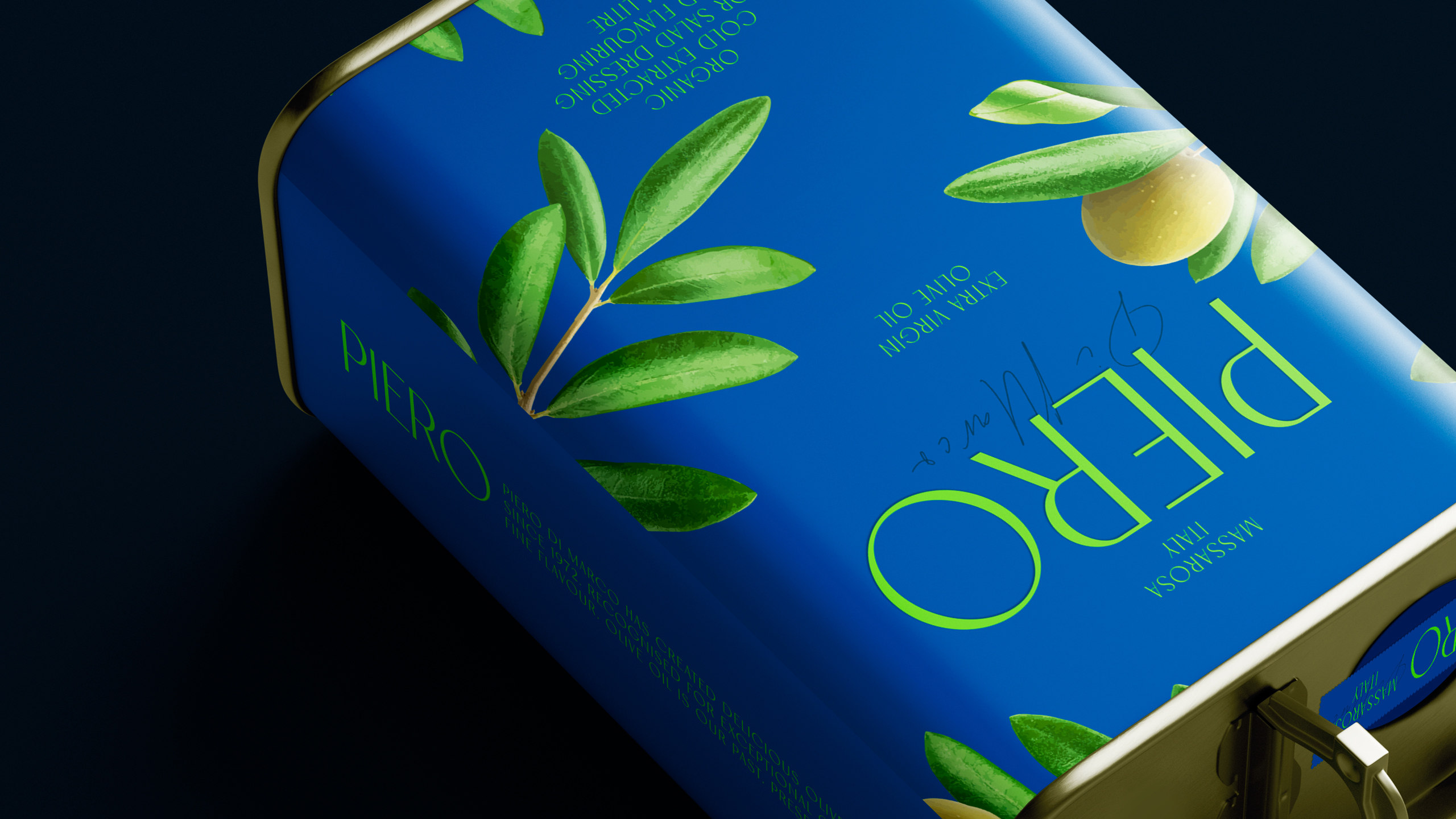
We found inspiration from the peaceful beauty of olive groves, specifically, the view of branches swaying gently against the sky. This evocative scene, brought to life through detailed illustrations, evokes a sense of natural purity and connection to the earth while speaks to its commitment to organic, unadulterated products. By introducing a sky-blue background as the primary colour, accented by vibrant greens and a majestic jewel-toned blue, we crafted a visual identity that is both striking and timeless.
Our approach was to avoid overly aggressive or flashy design elements. Instead, we focused on a clean, refined aesthetic that subtly communicates PIERO’s brand values: simplicity, quality, and legacy. The result is a packaging design that only catches the eye but also resonates deeply with the brand’s natural and organic roots.
