Chídr crafted
an identity &
art direction
that exude
warmth
and tranquil
serenity,
brimming with
passion and
excitement
for the
adventure
of discovery
with ADORA.
Context
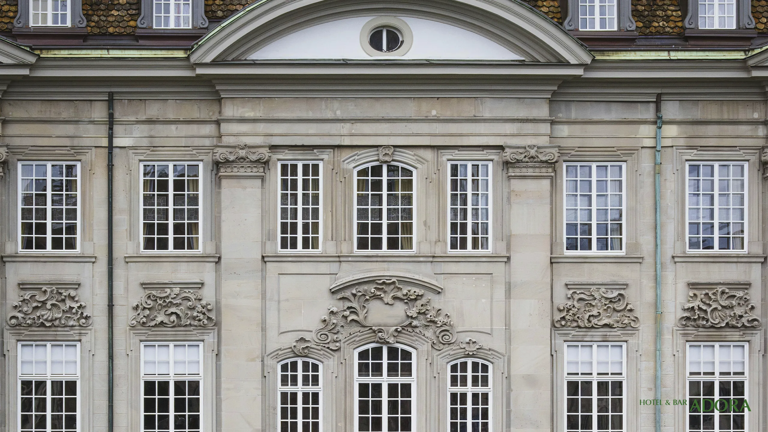
Many hotels and inns nestled at the crossroads of verdant mountains, tranquil lakes, and expansive greenery retain the charm of their early modern-century origins. These magnificent natural surroundings, combined with the timeless beauty of historic architecture, create a distinctive allure that captivates visitors.
Designing a brand identity for such hotels requires seamless integration with the natural environment and architecture. It also calls for crafting a compelling brand narrative and cultural experience that vividly conveys the journey’s charm and appeal, attracting visitors seeking accommodations that enrich their travels.
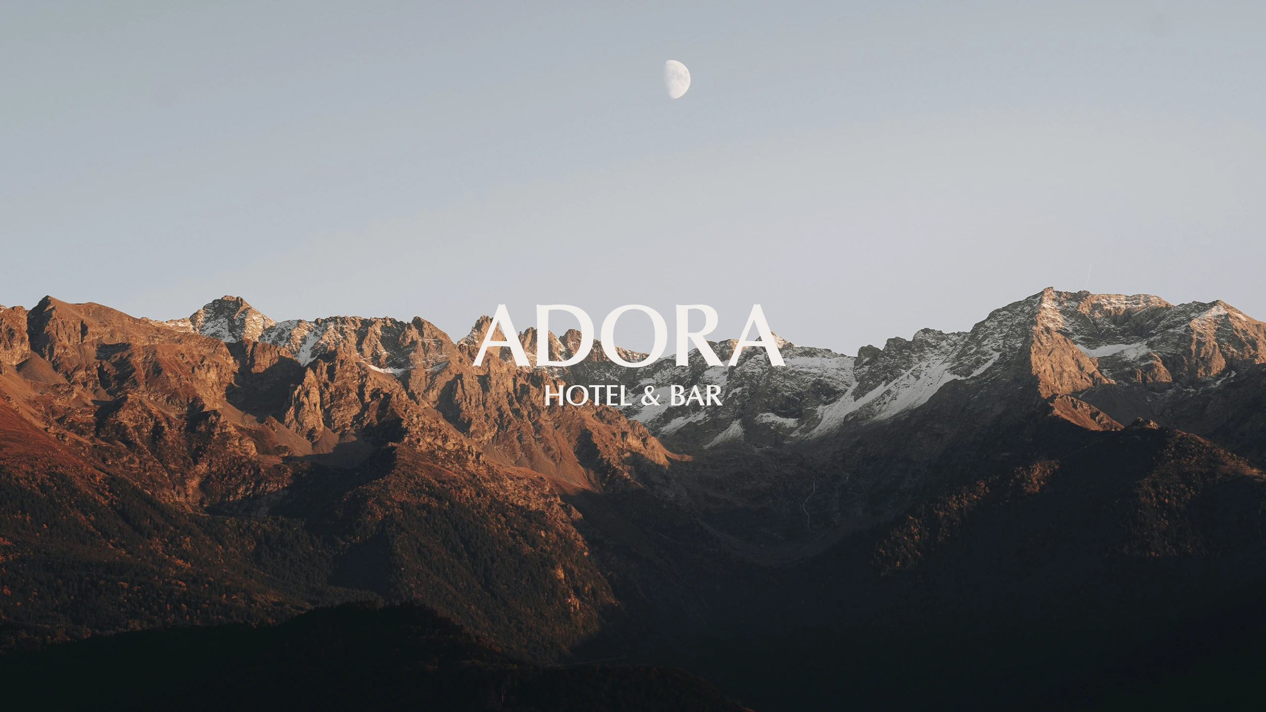
Positioning
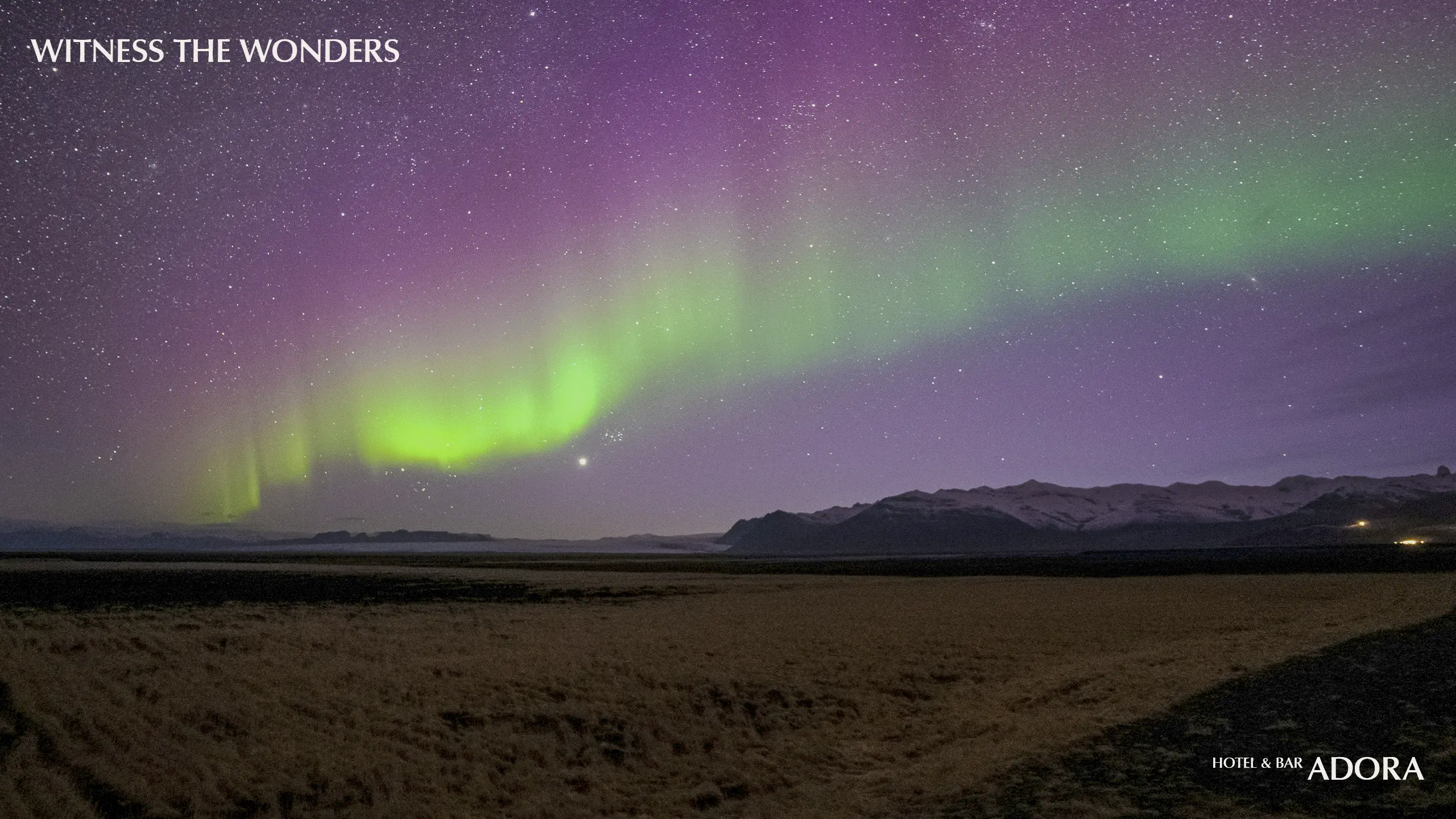
Visitors to this destination are drawn by a love of mountain adventures, lakeside escapes, skiing, and other highland experiences. Their journeys are often driven by curiosity and a desire for discovery. When selecting accommodations, they seek places that are unique and full of character, yet well-equipped and warmly hospitable.
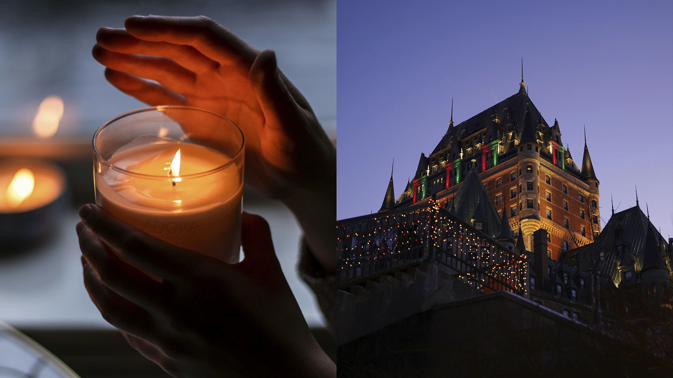
With this in mind, we identified “adventure” and “humanised warmth” as the core themes, shaping a brand identity and art direction that exude comfort, classical elegance, and tranquil serenity—all while brimming with passion and excitement.

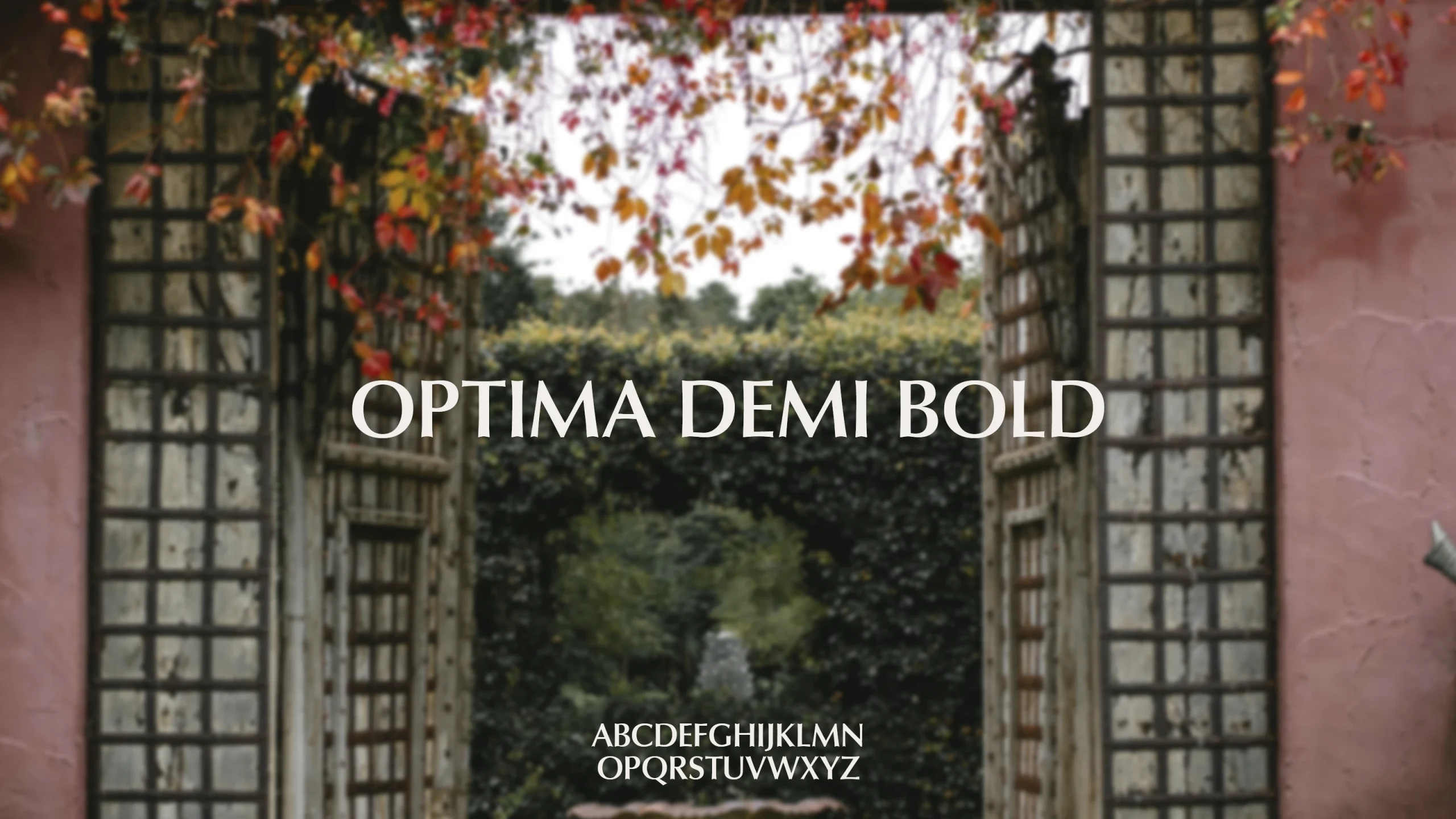
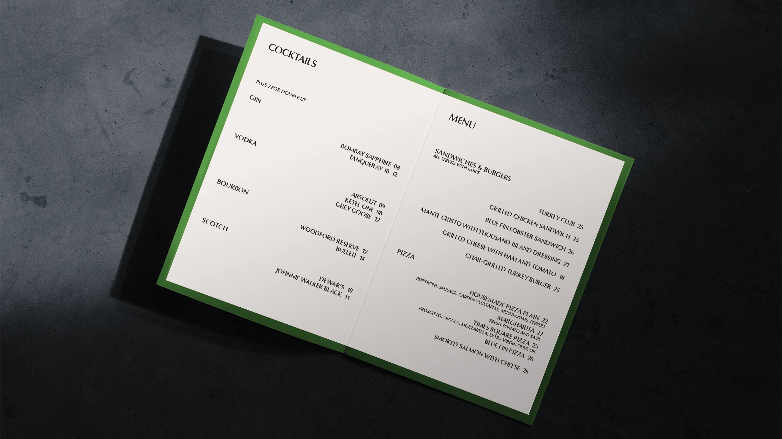
Typography
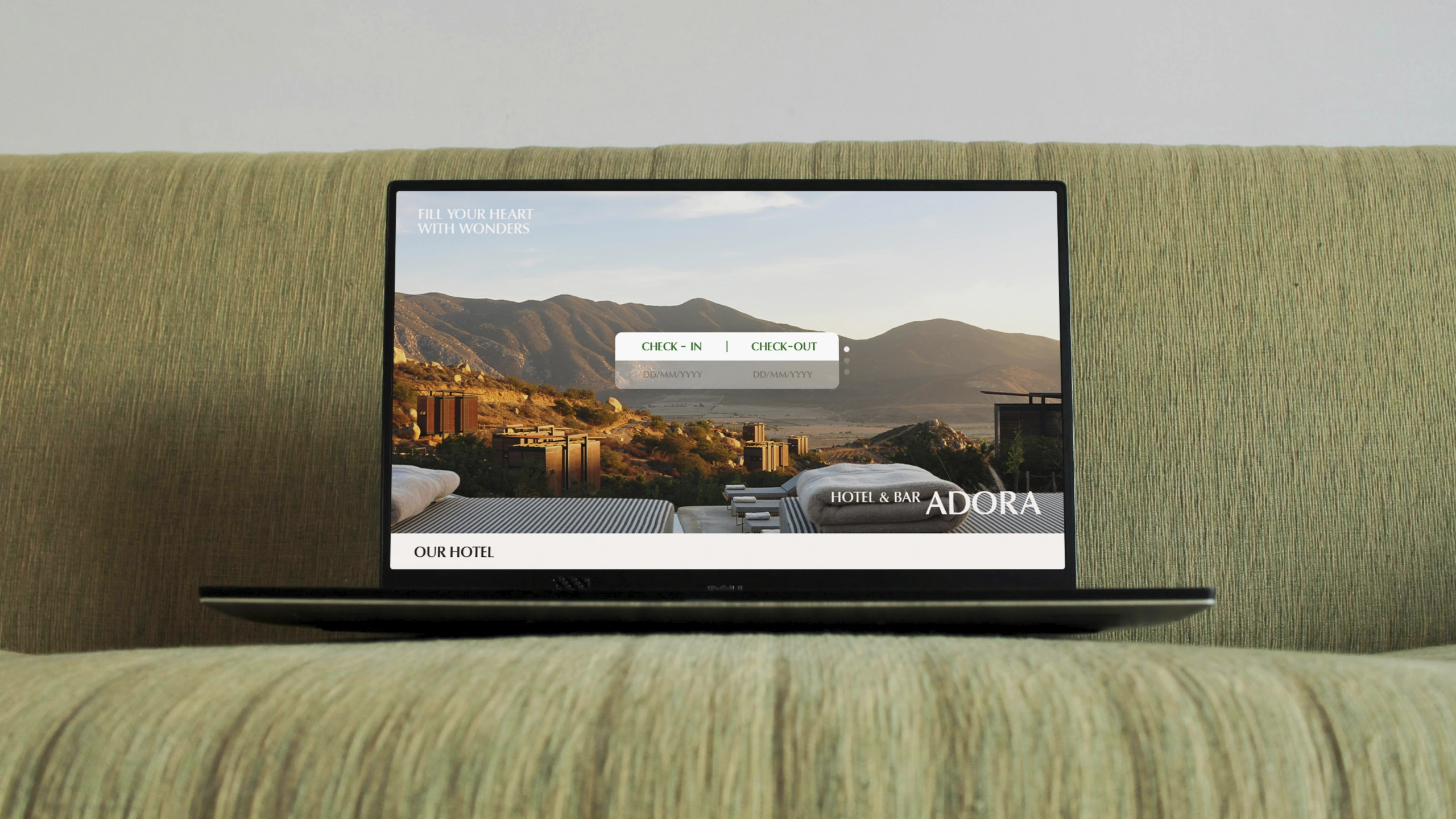
For typography, we chose the humanist sans-serif typeface Optima. It feels refined, full-bodied, and warm—avoiding the overly rigid, cold, sharp, or outdated qualities in traditional serif fonts often used in hotel branding.
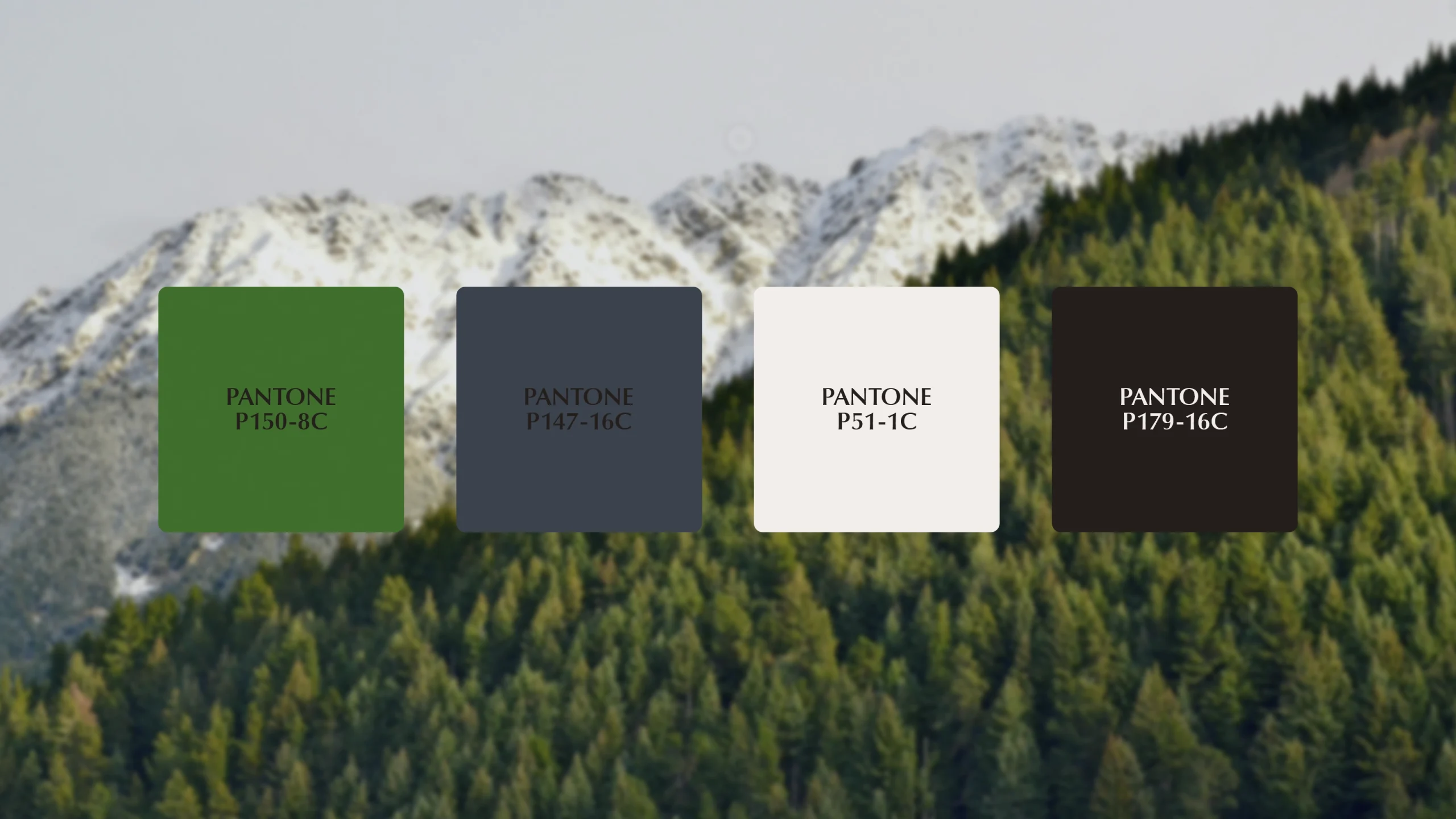
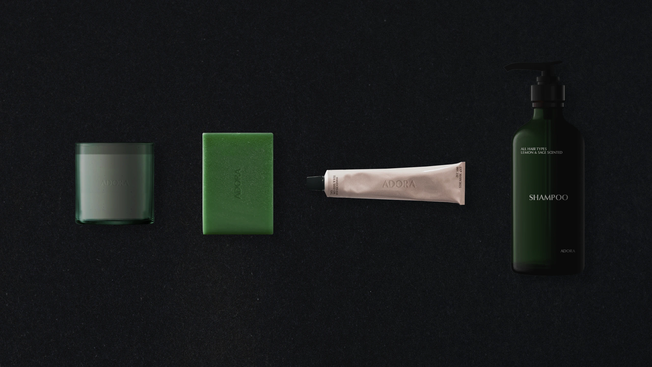
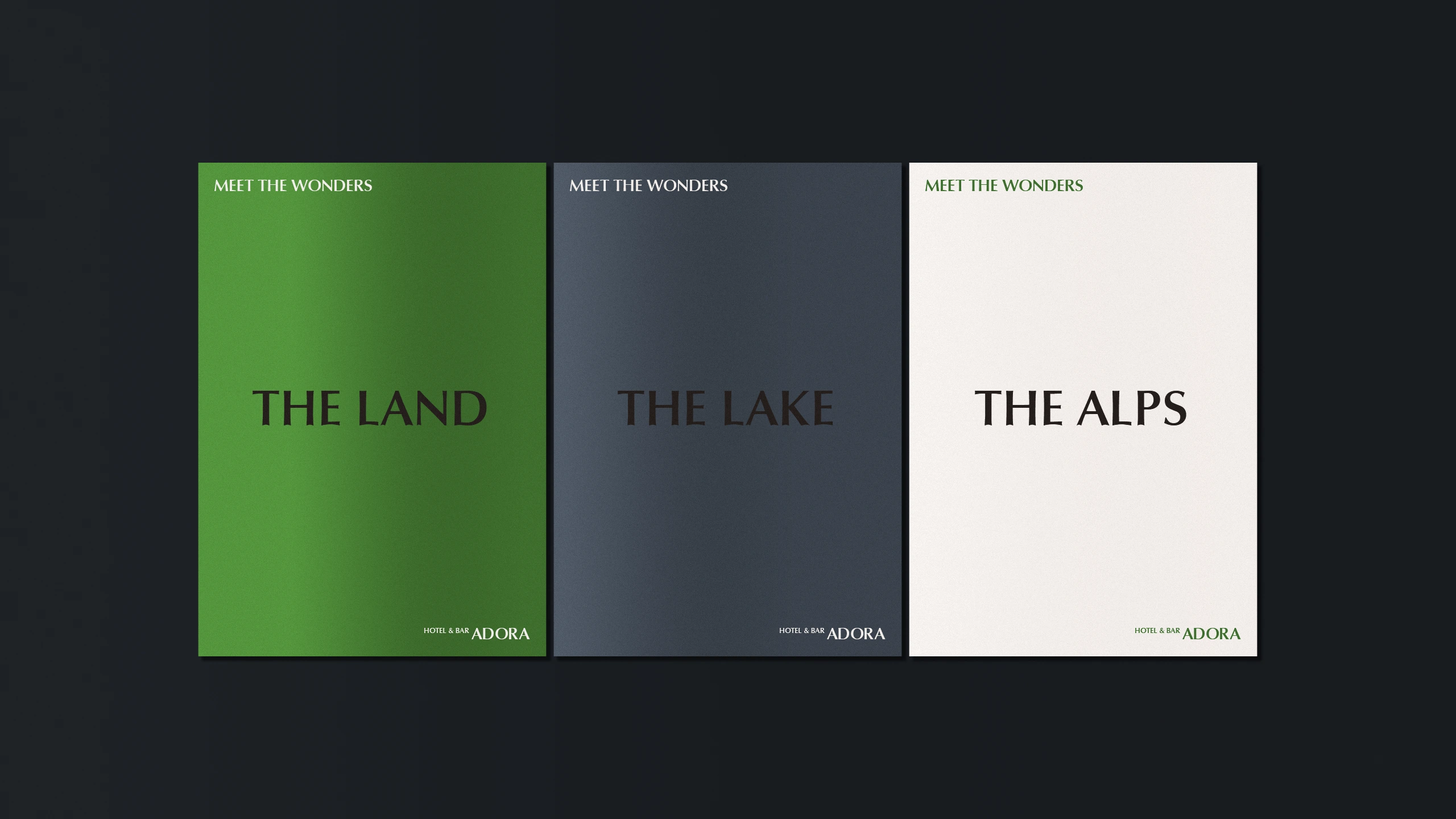
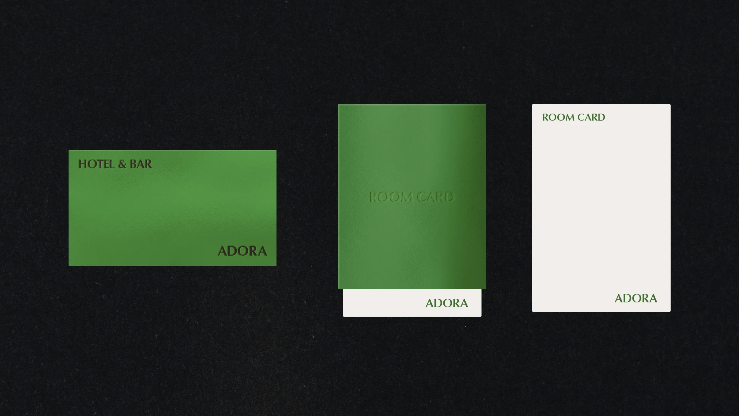
Colour
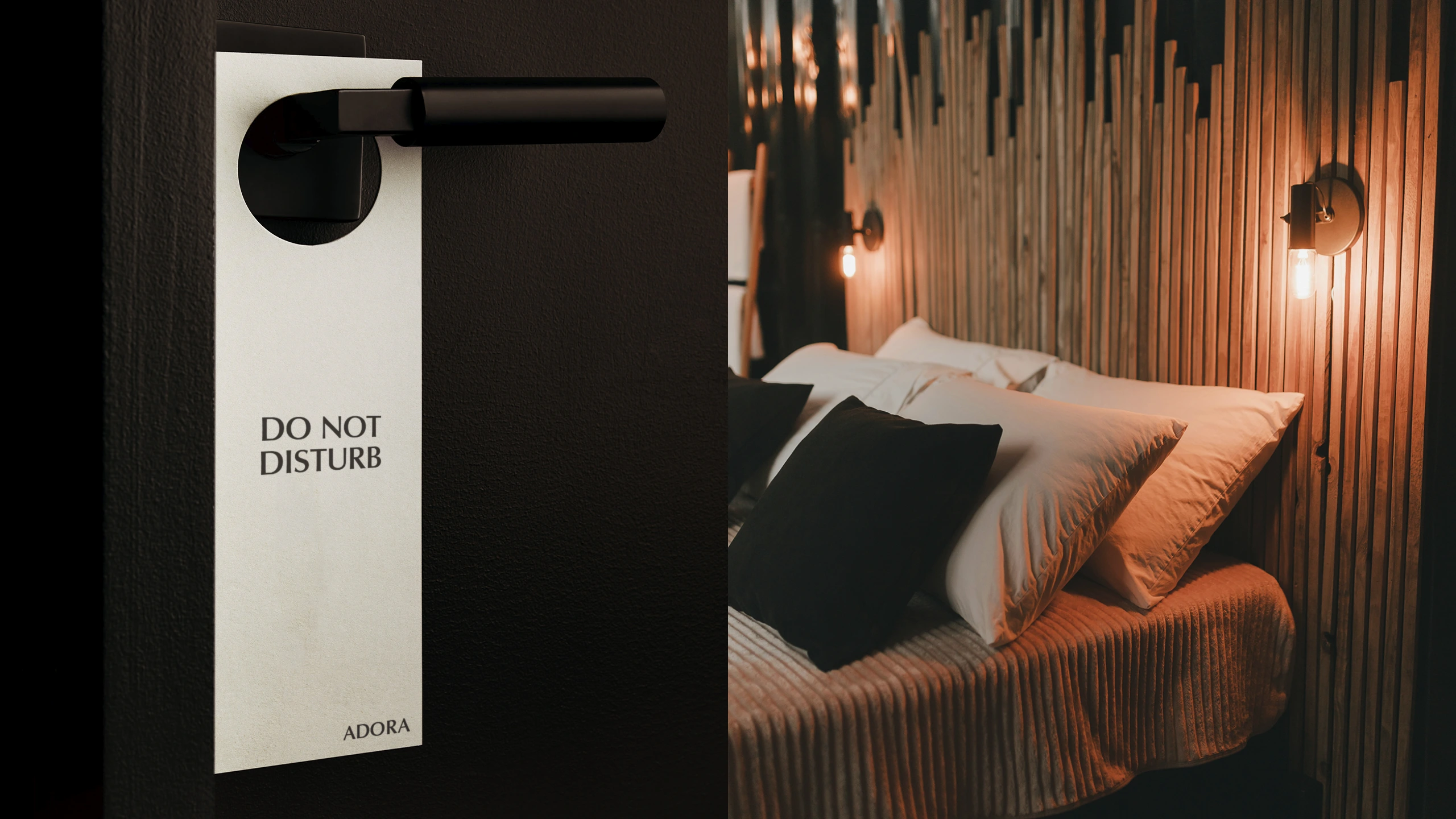
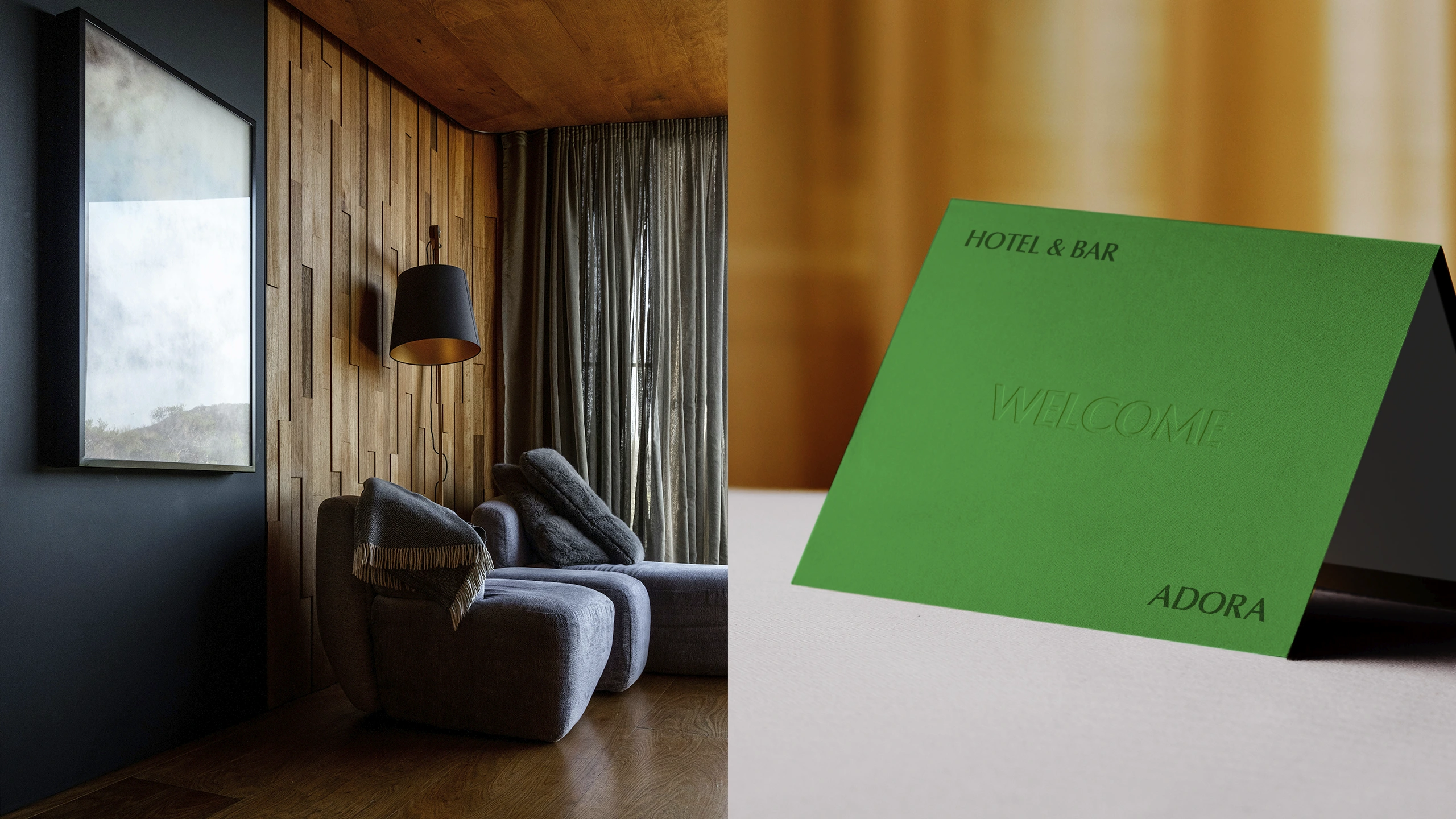
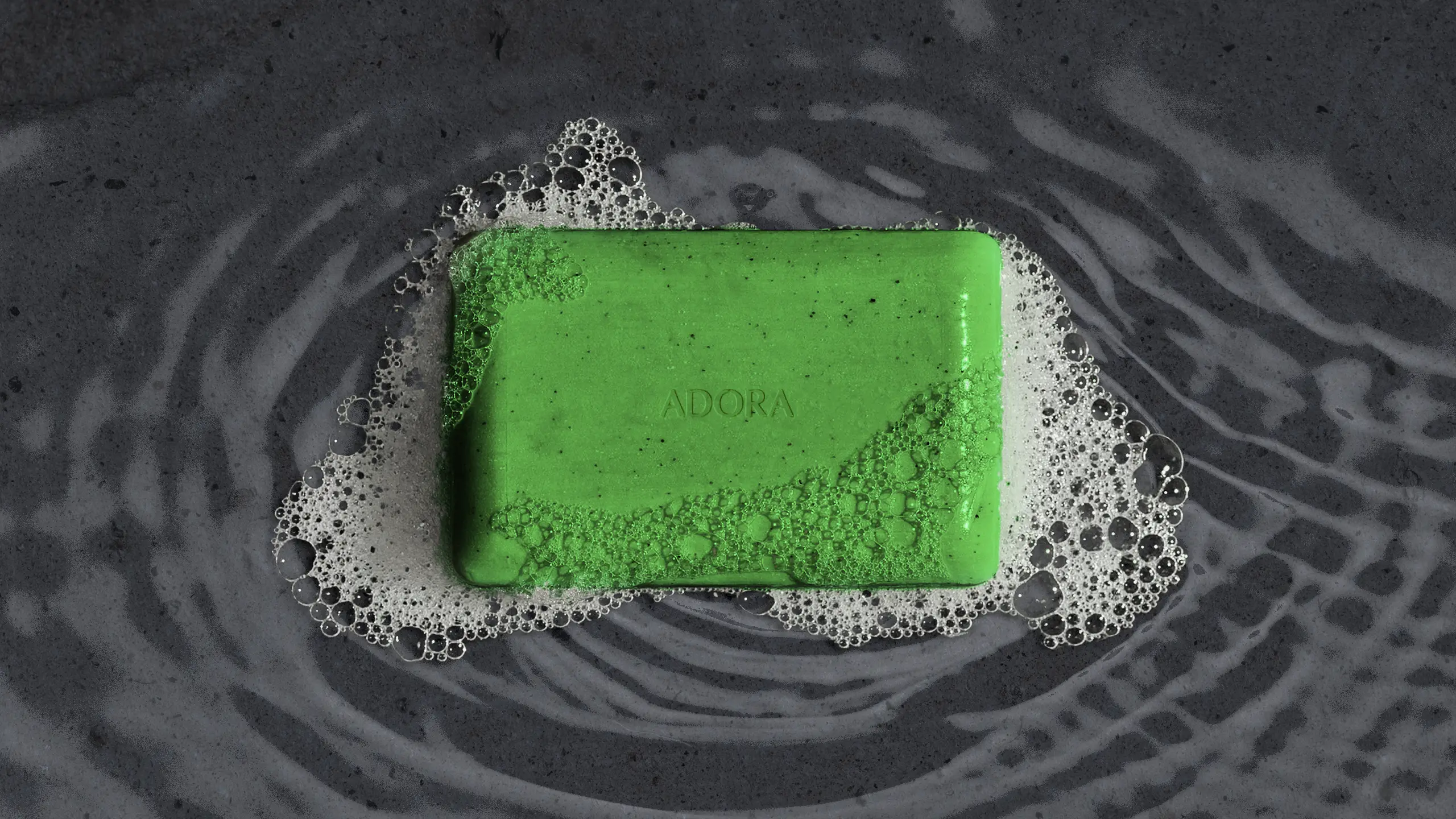
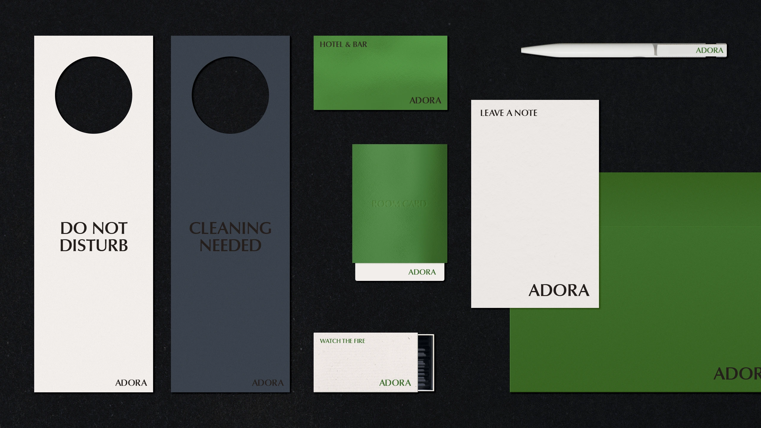
In terms of colour, we avoided overly saturated or discordant tones. Instead, we focused on a gentle algae green as primary tone and a serene blue hue like grounding slate and lake, complemented by neutral hues like off-white and charcoal grey. These tones harmonise beautifully with the surrounding natural environment while integrating seamlessly into the hotel’s interiors, which often feature warm lighting and natural textures. This palette feels balanced—neither out of place nor overly subdued.
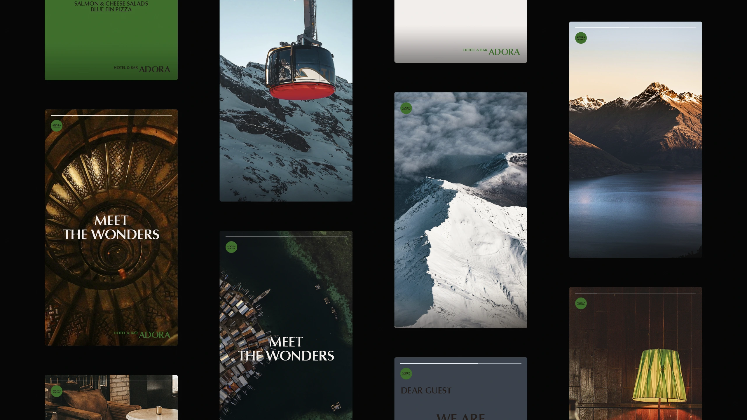
Decoration
A closer look at the printed materials reveals a consistent use of carefully selected type sizes, with embossed details incorporated as decorative elements. This allows the hotel to maintain cohesion by producing these materials with a single embossing setup.
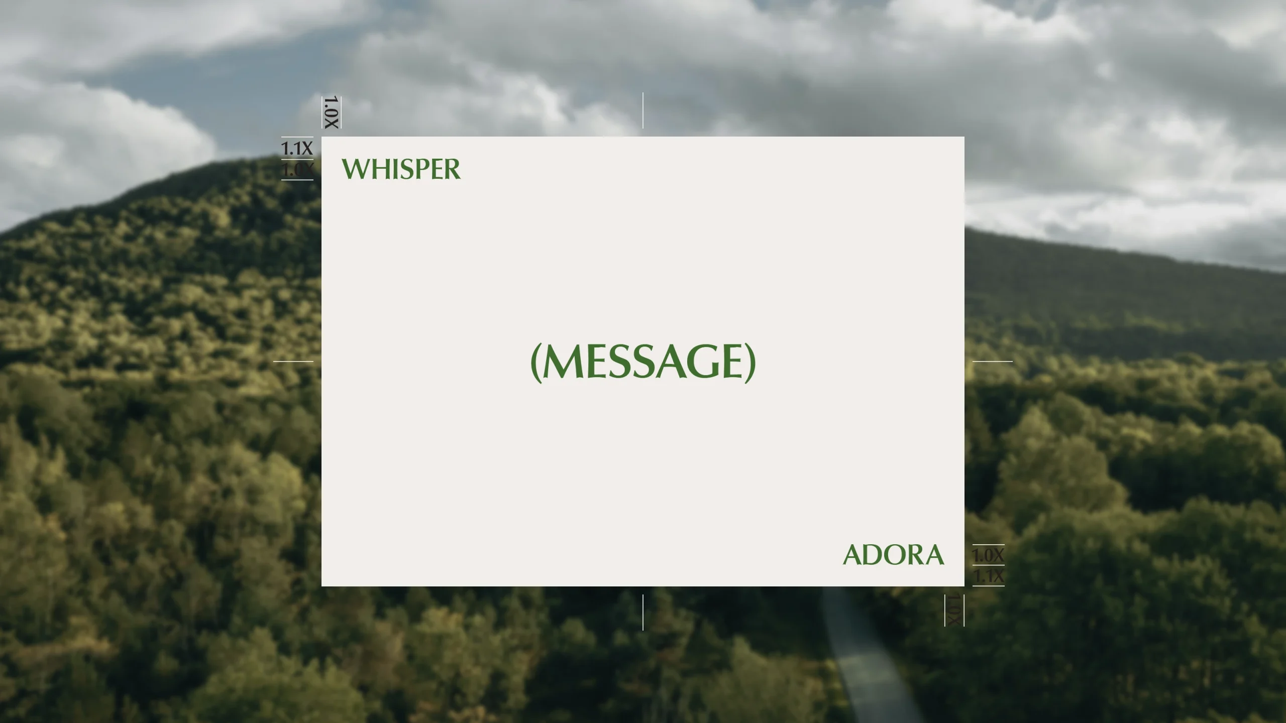
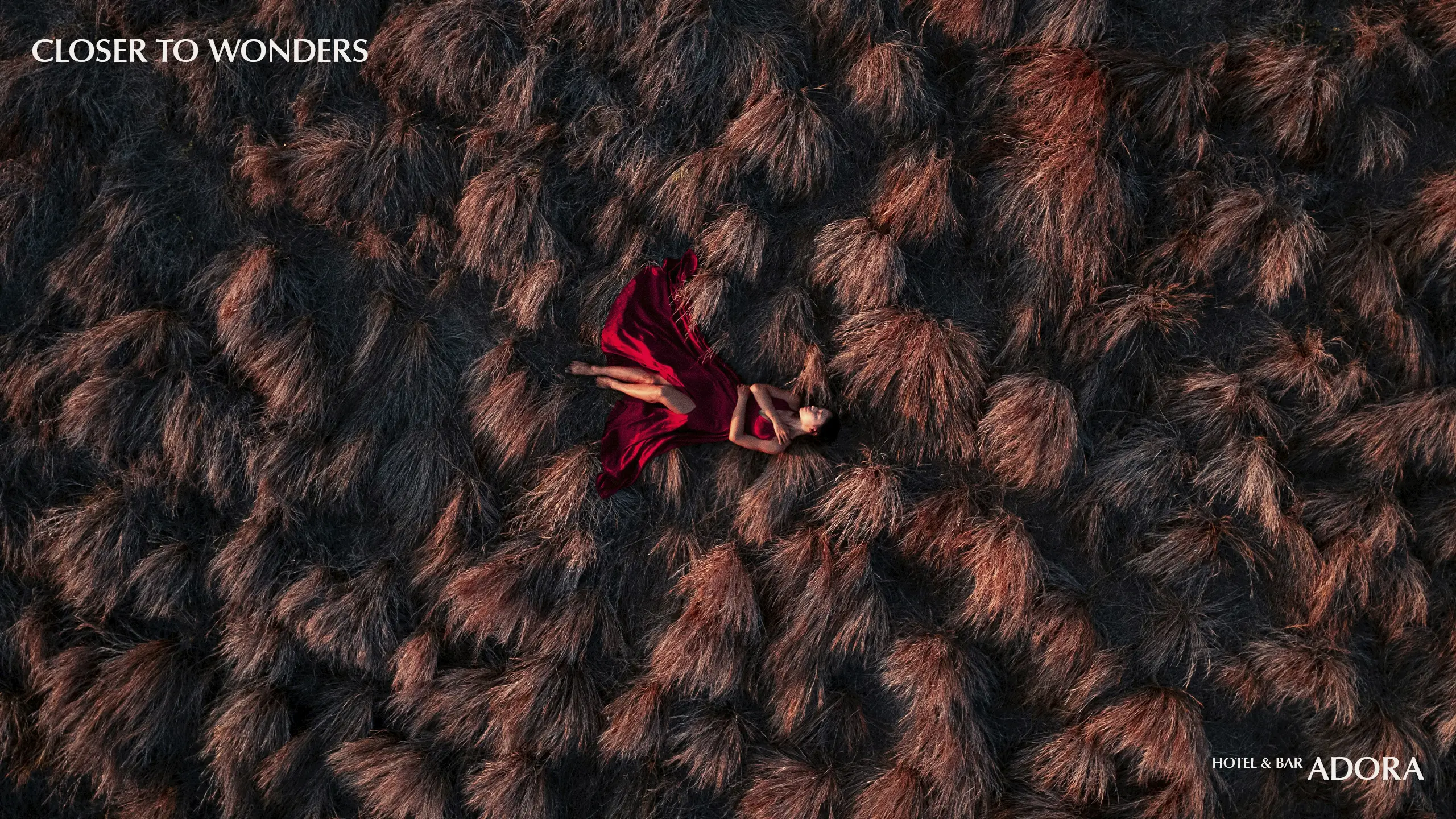
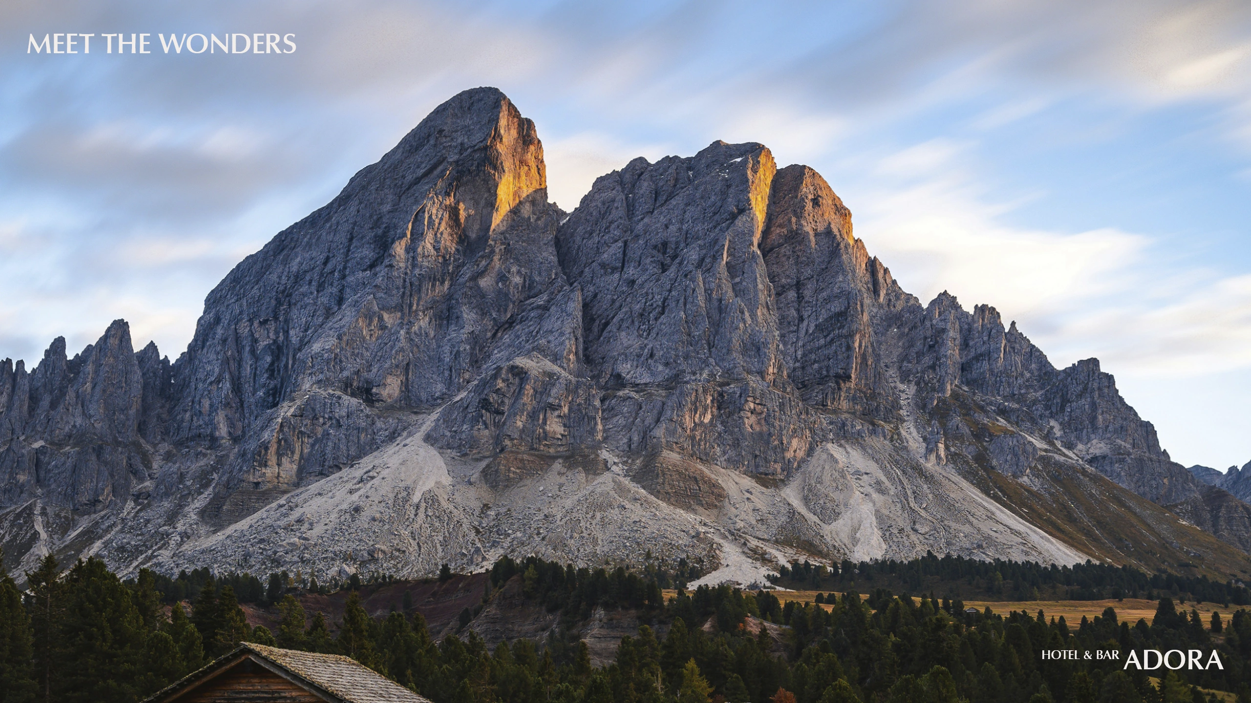
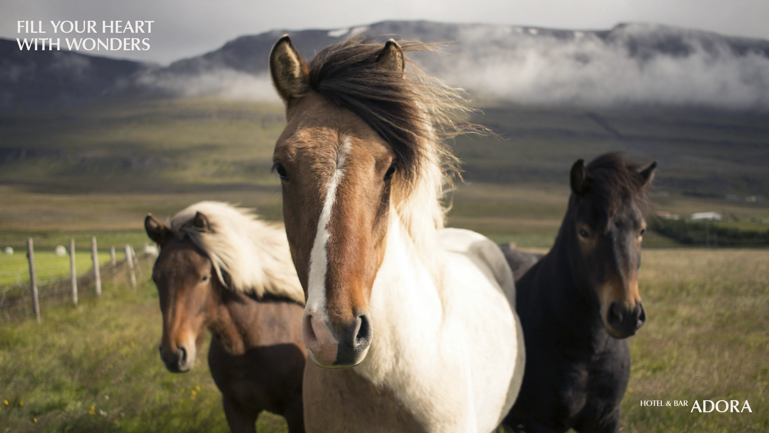
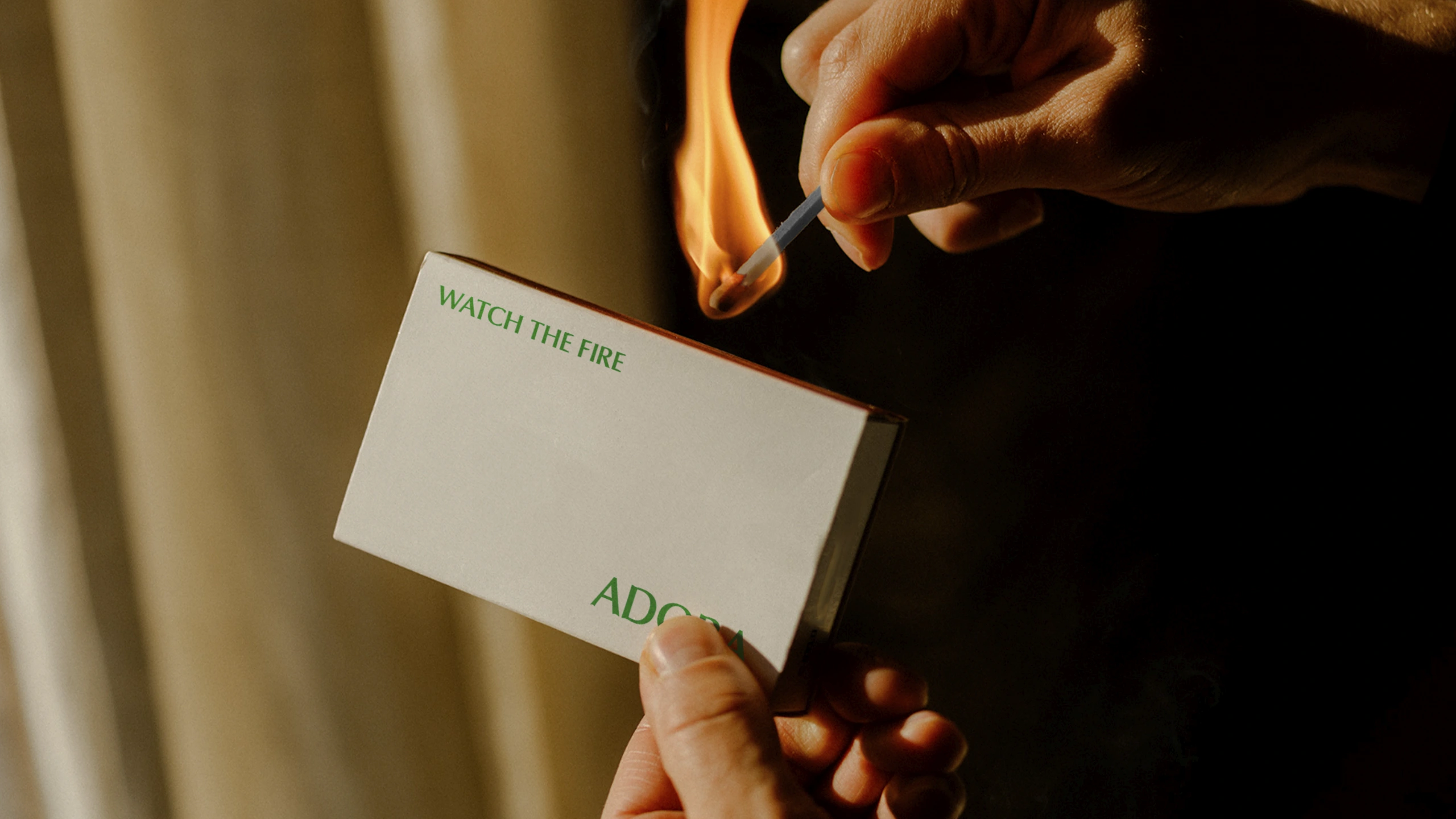
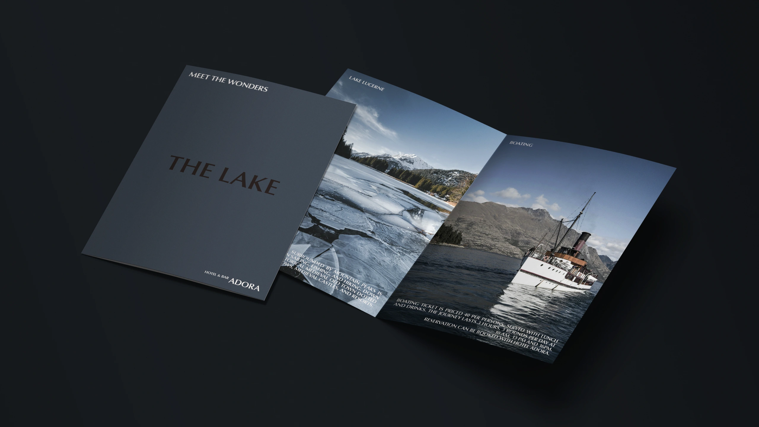
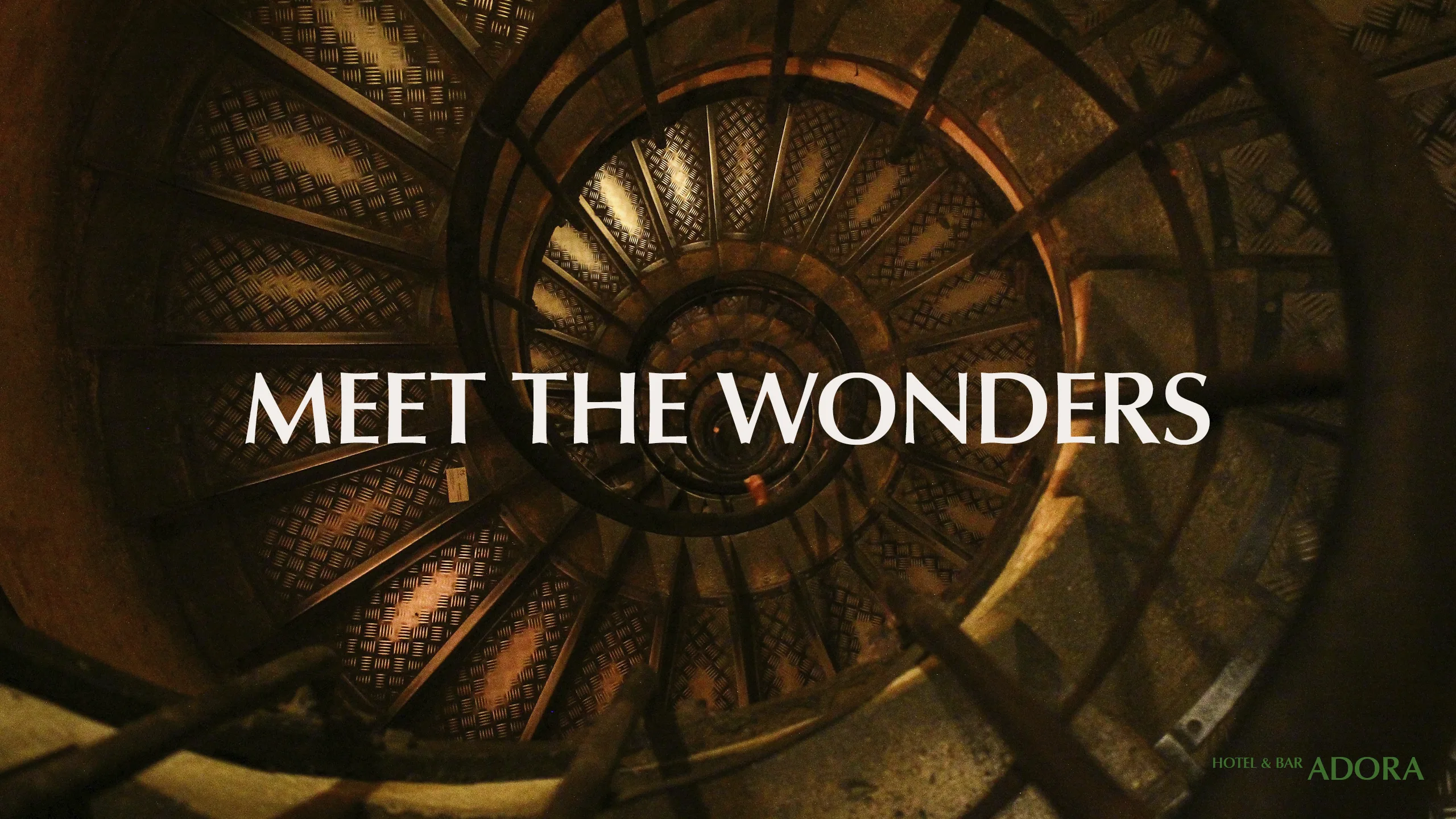
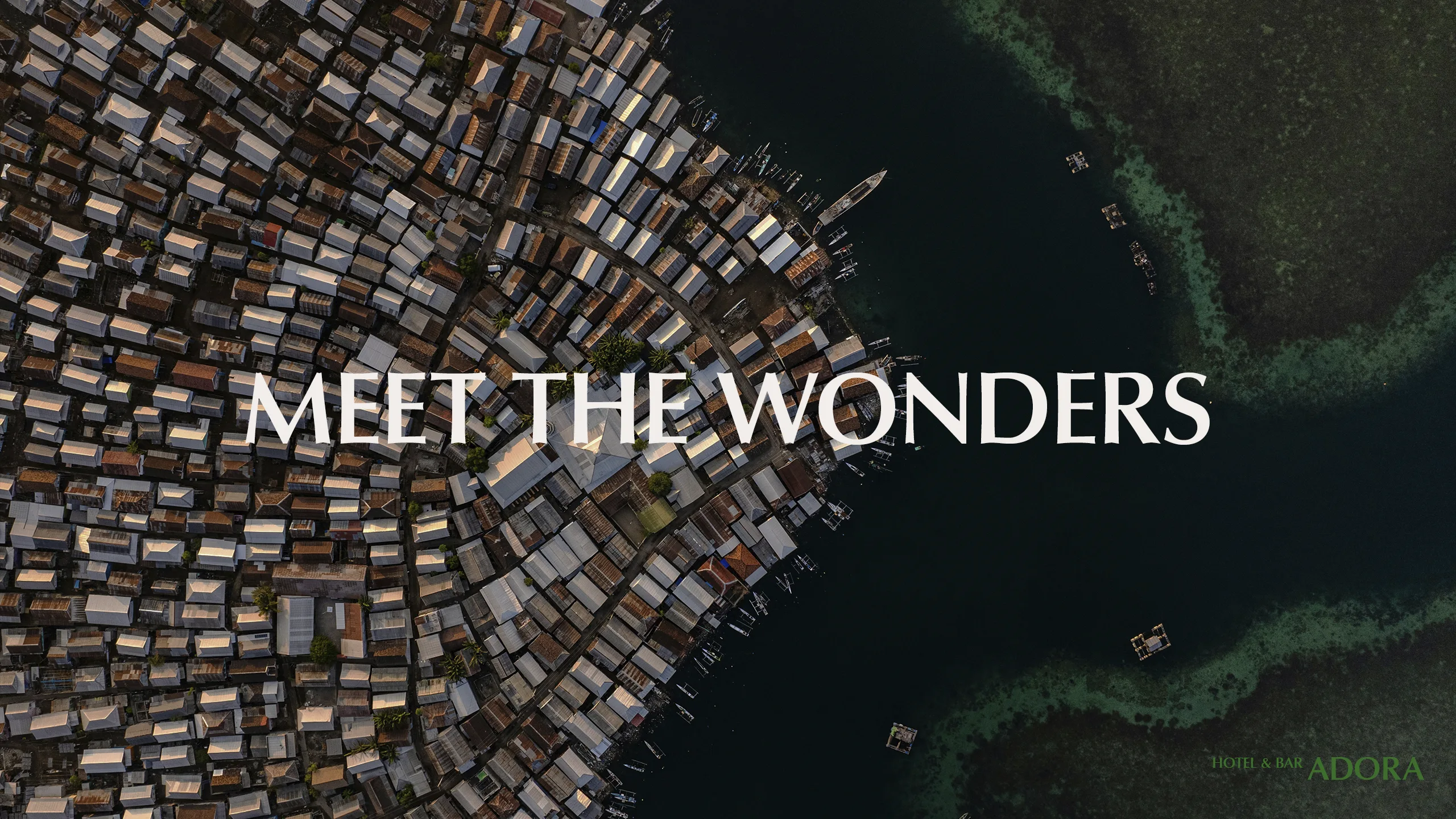
Messaging
For copywriting, we adopted a casual, conversational tone with phrases like “leave a note” and “meet the wonders”. This approach adds a personal touch, creating the impression of a companion offering guidance, recommendations, or thoughtful company. Such linguistic details subtly convey the attentive and personalised care that defines the guest experience.