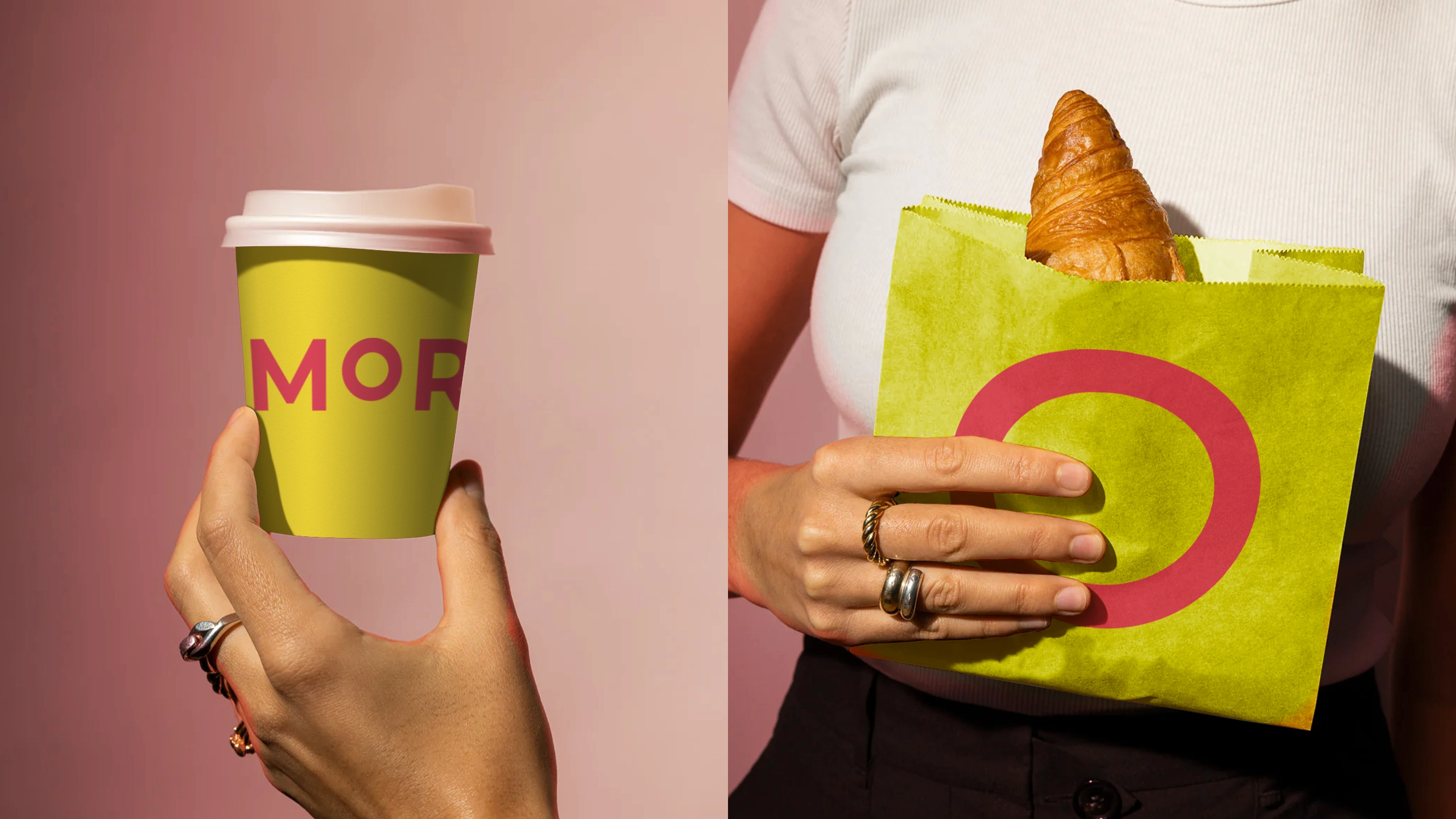
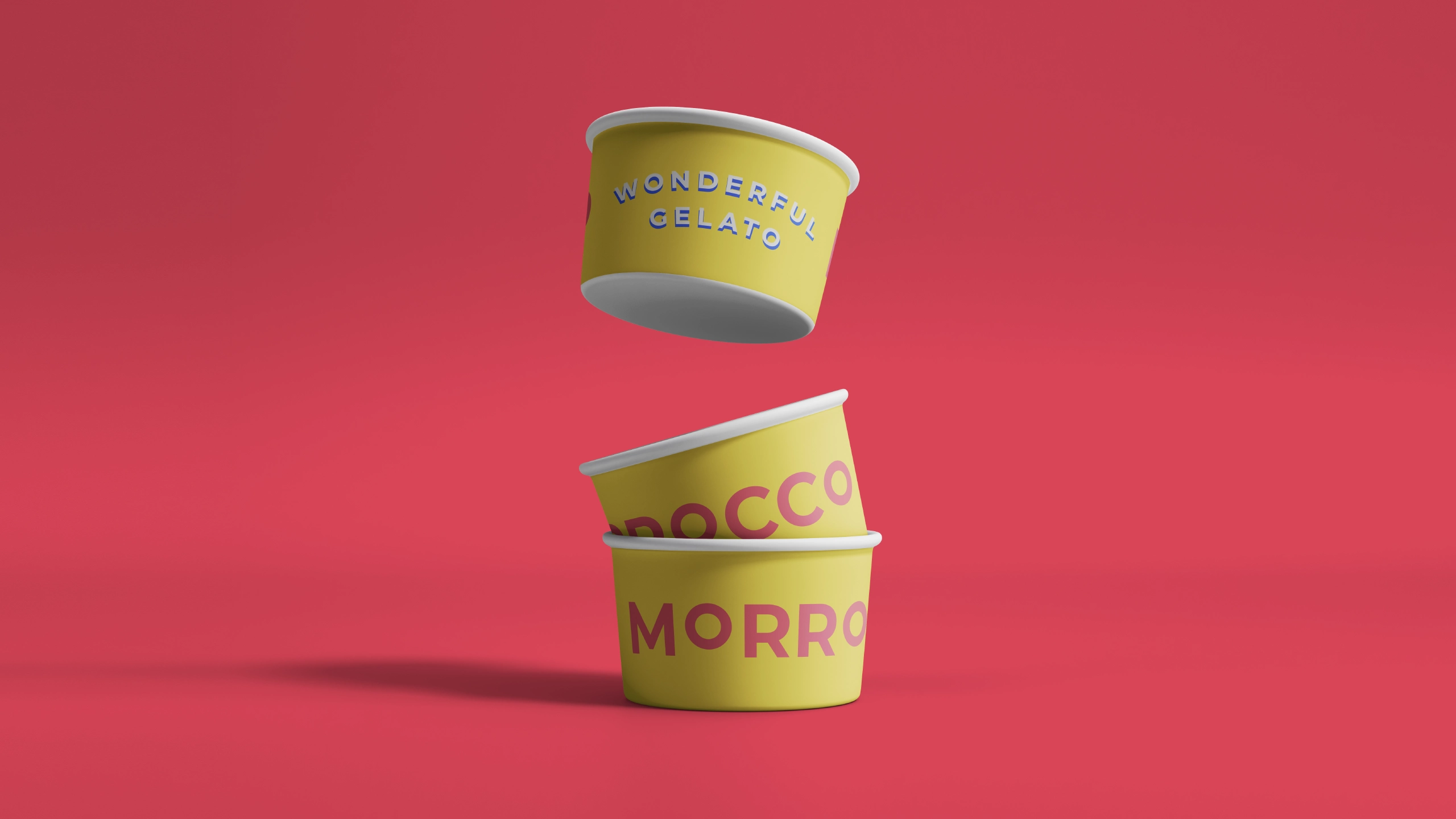
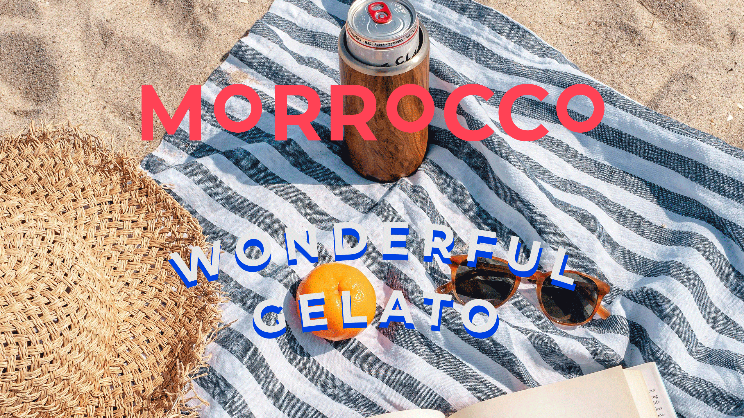
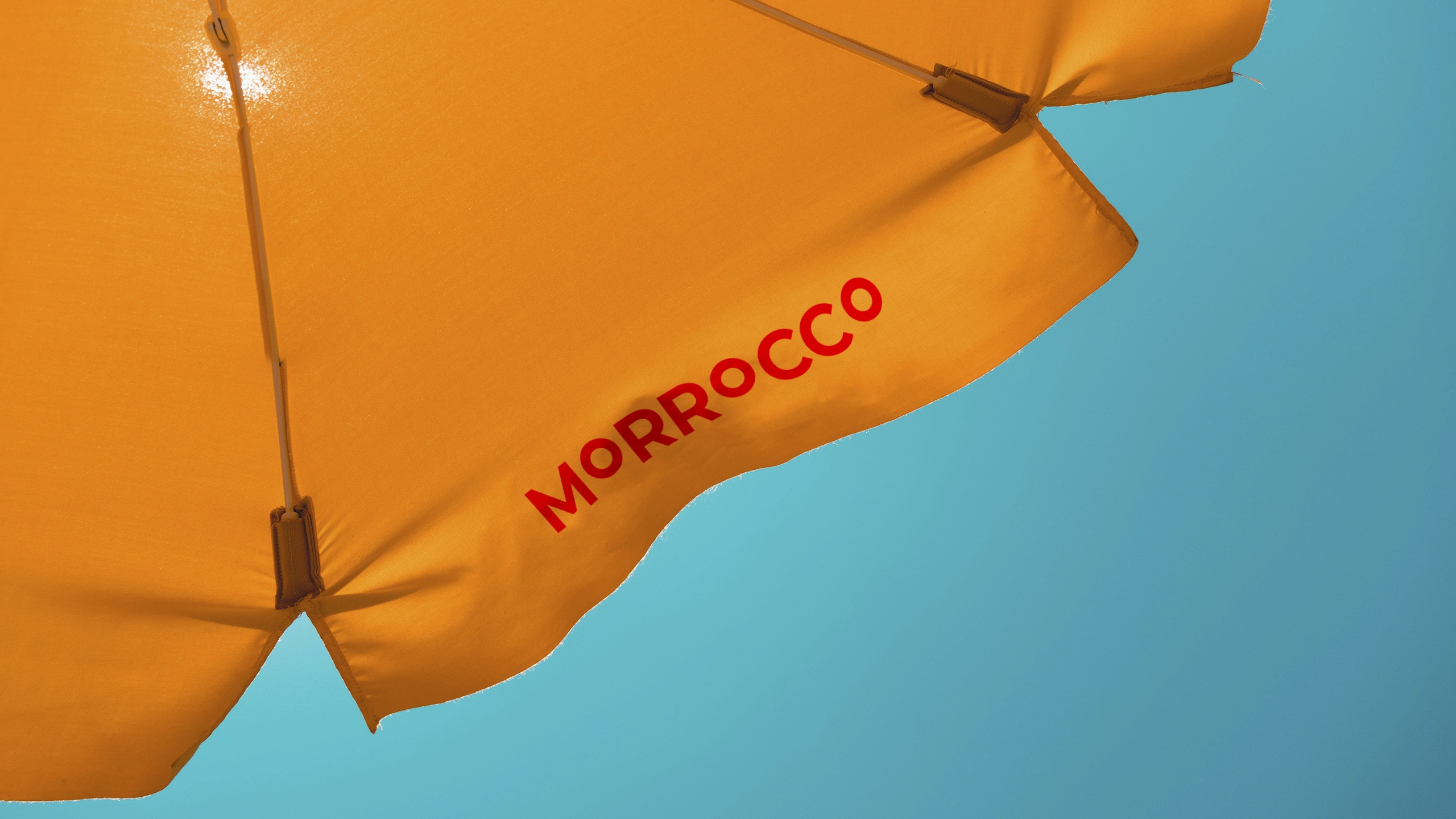
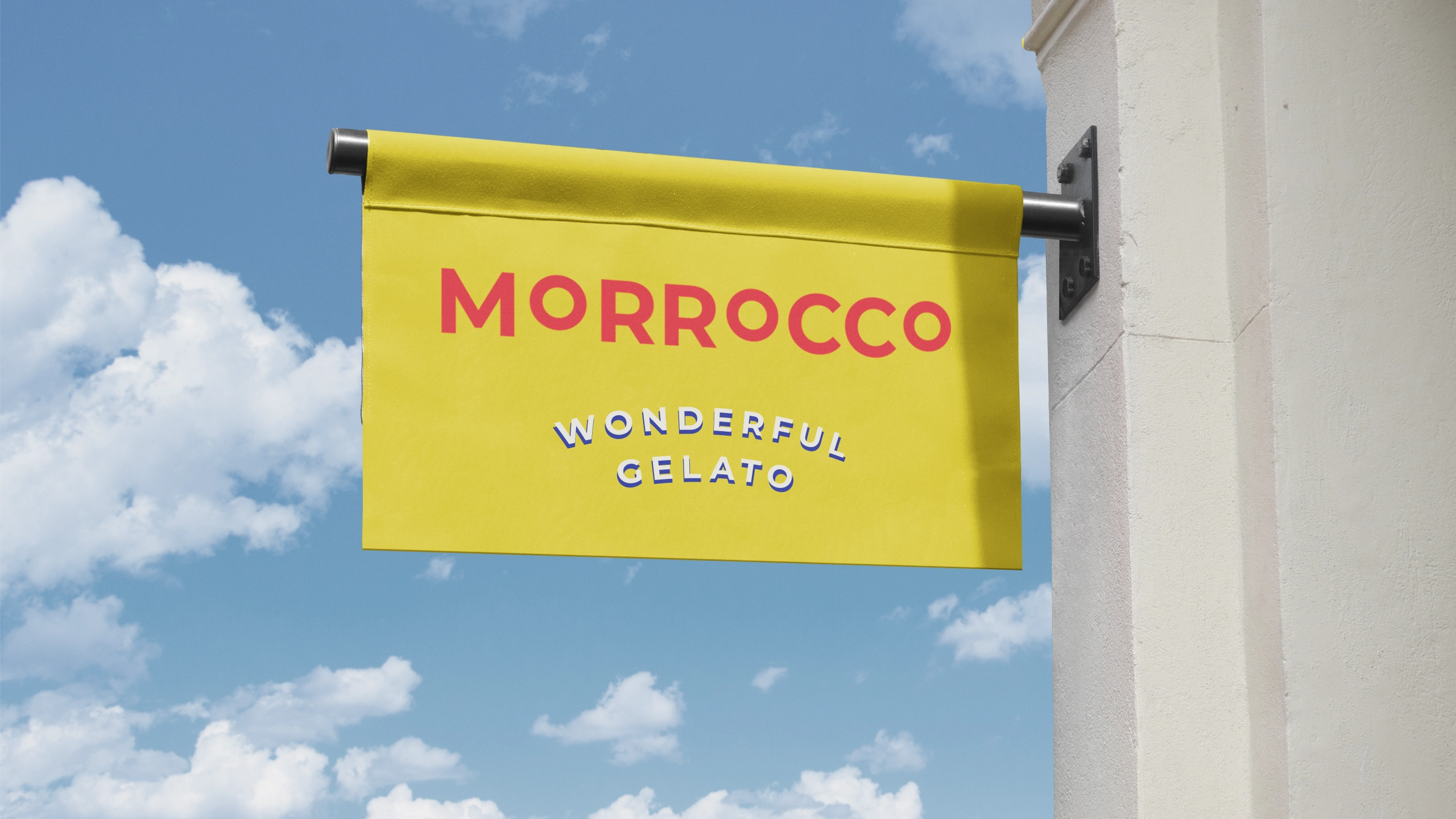
MORROCCO
joyfully
celebrates
its wonderful
gelato with
a new
brand look
crafted
by Chídr.
Infused with
a playful,
costal charm,
it transforms
family-owned
ice cream
shop
into a lively
destination.
Execution
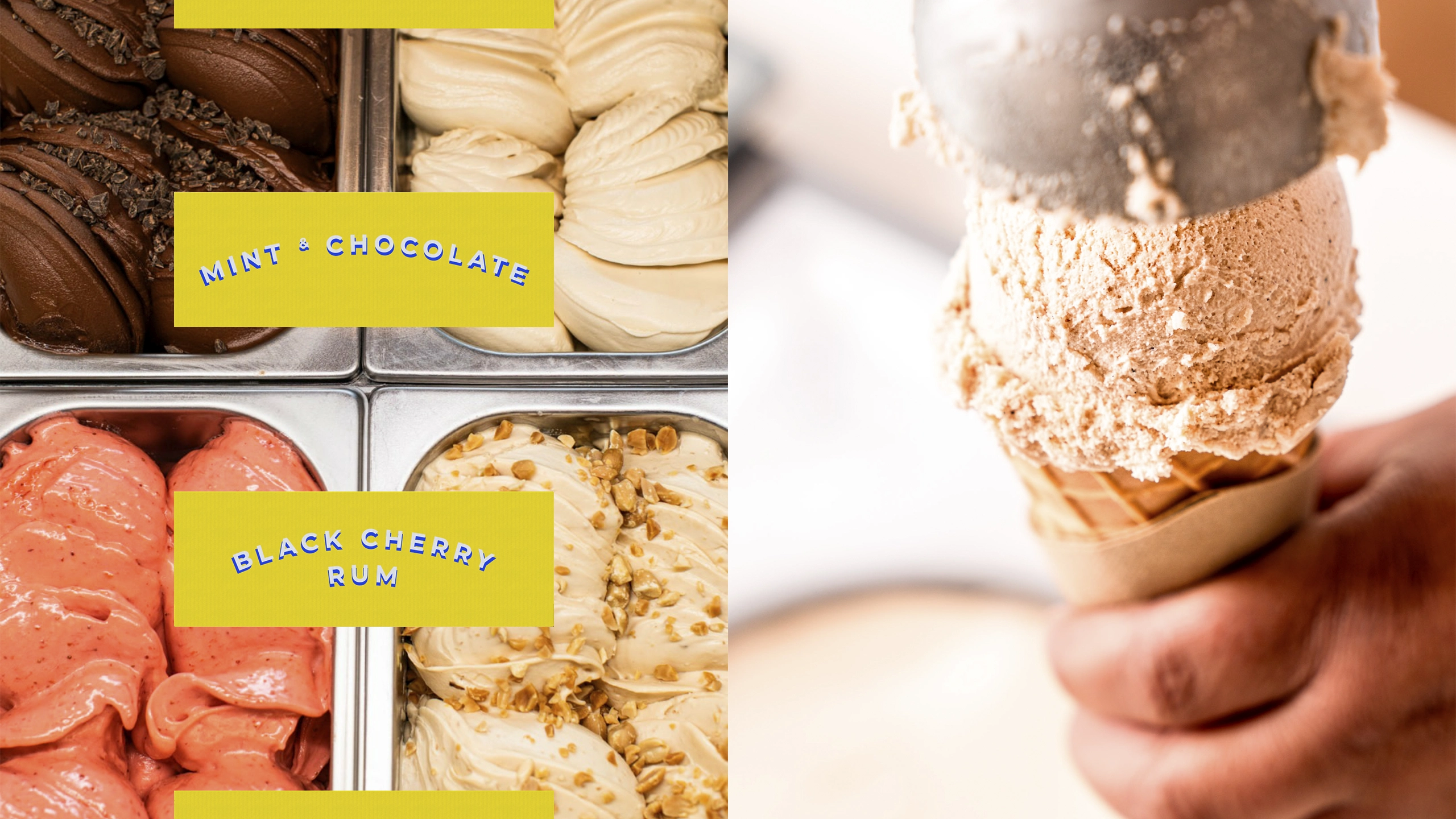
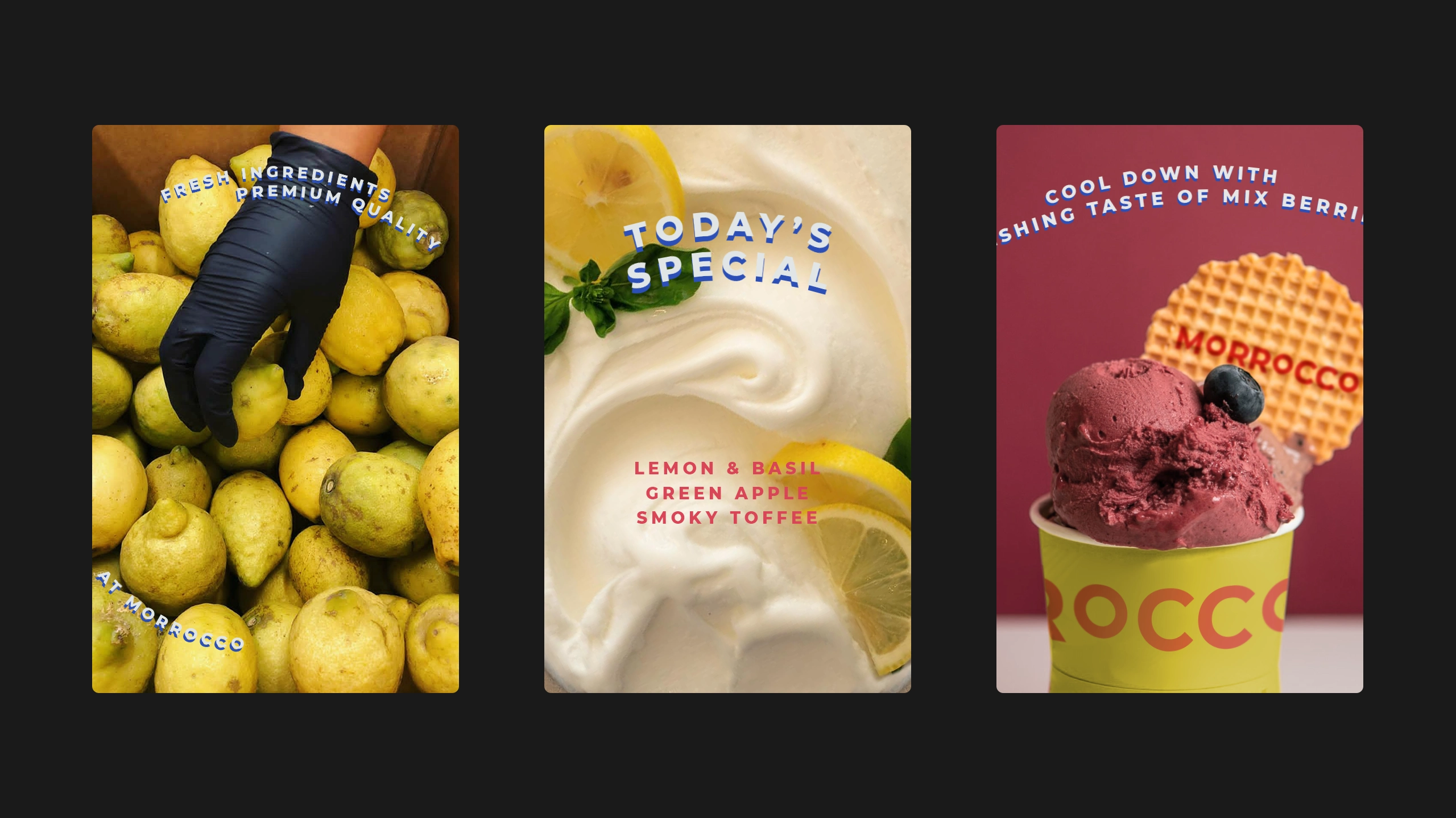
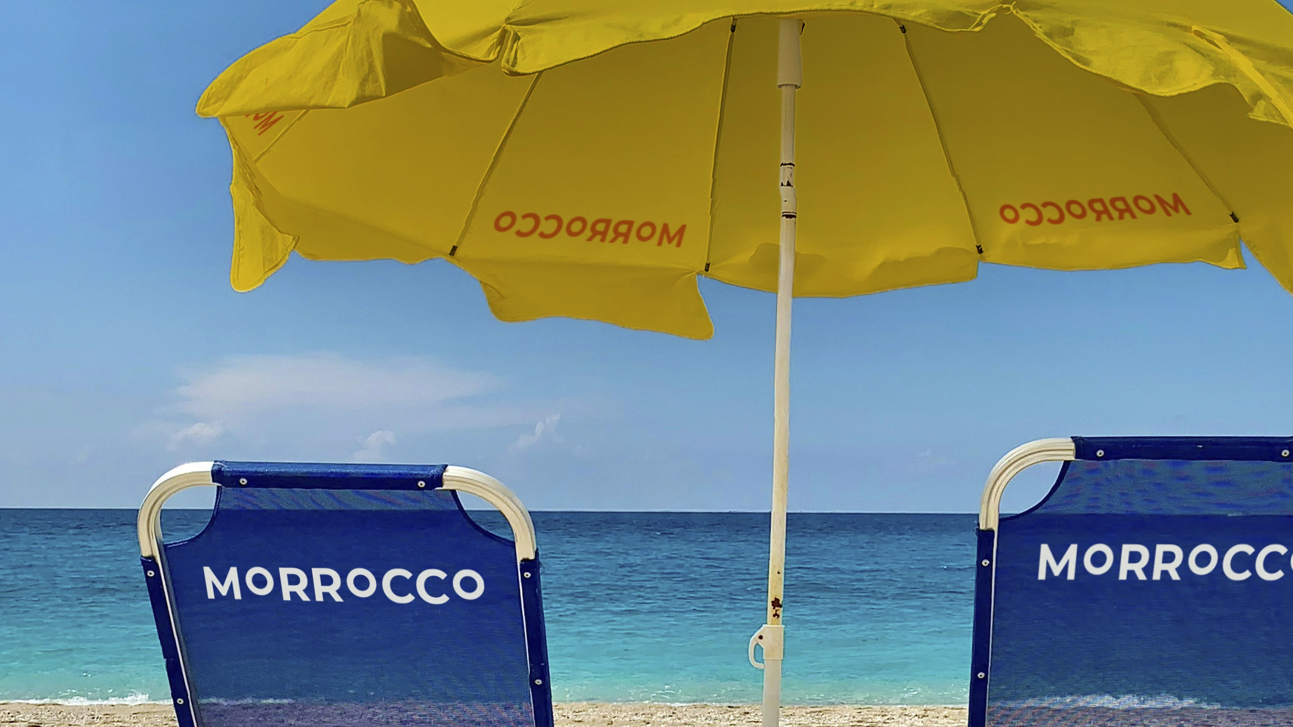
Drawing inspiration from the beach, the azure sky and delectable fruits, we crafted a bright and delightful visual style that not only whets the appetite but also leaves a lasting mark on the vibrant coastal scene.
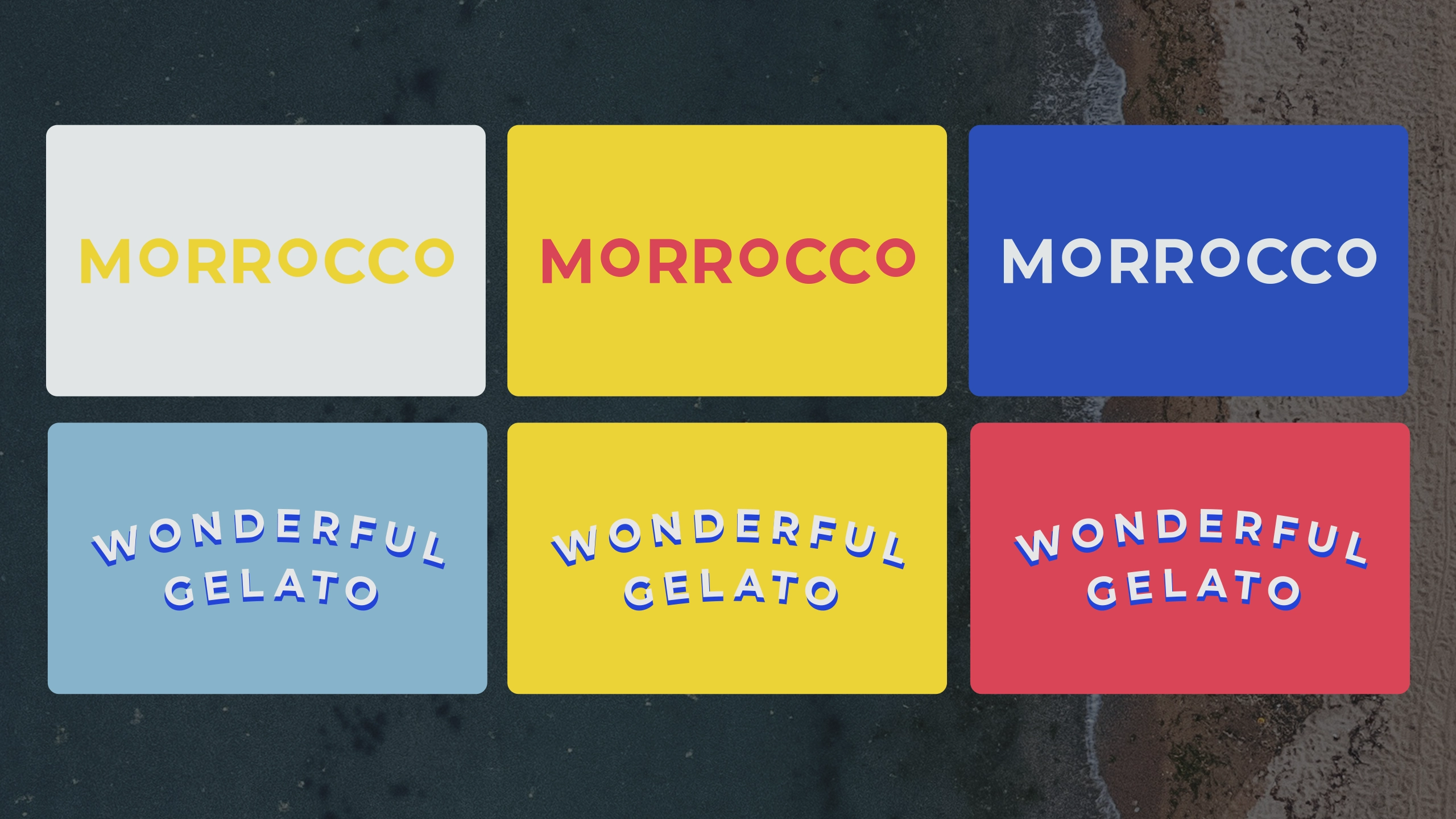
MORROCCO is quite a unique brand name with repeated characters. Chídr playfully amplifies this feature by differentiating the sizes of letters, creating an impressively recognisable feature.
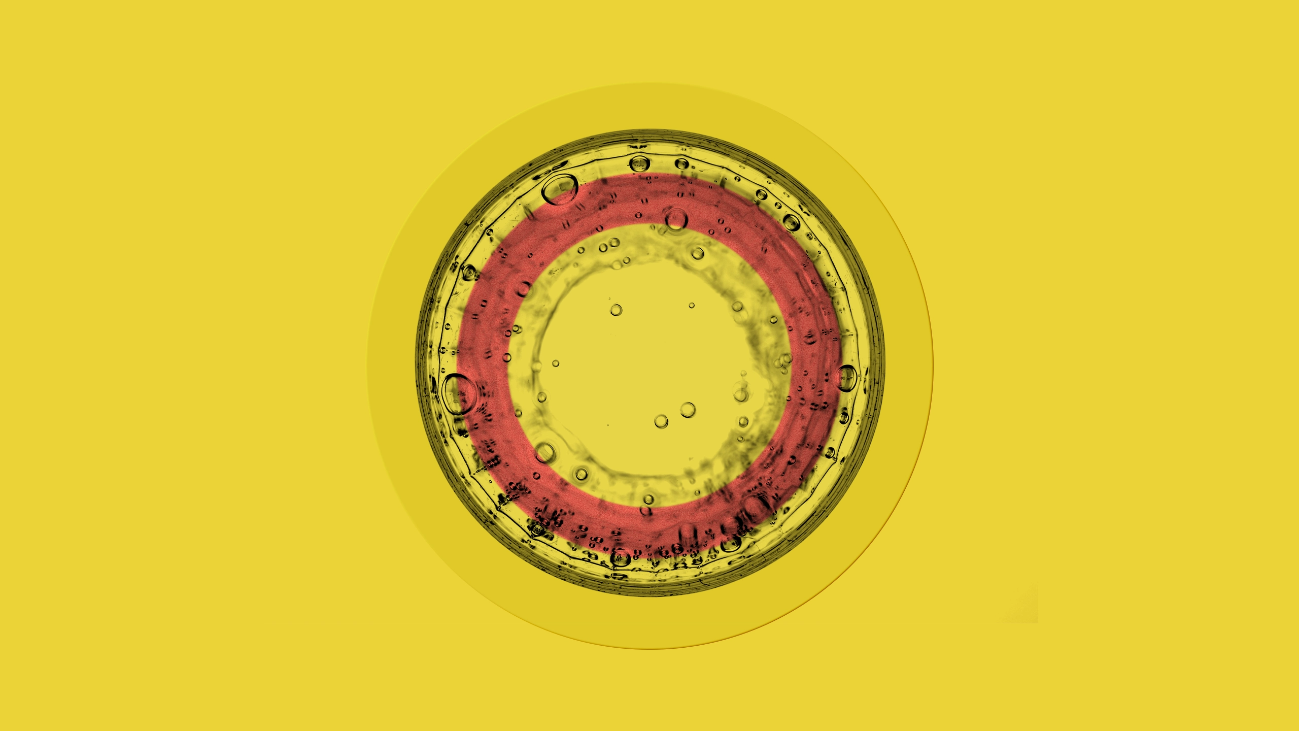
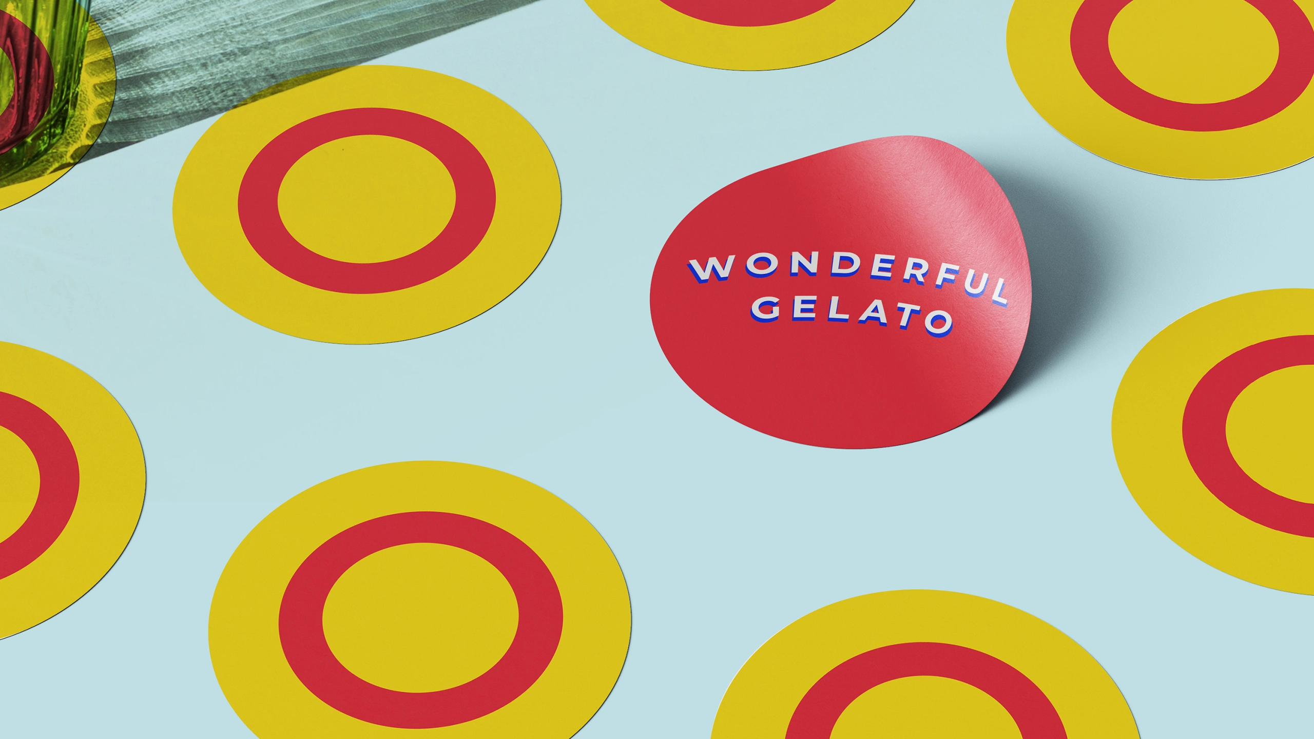
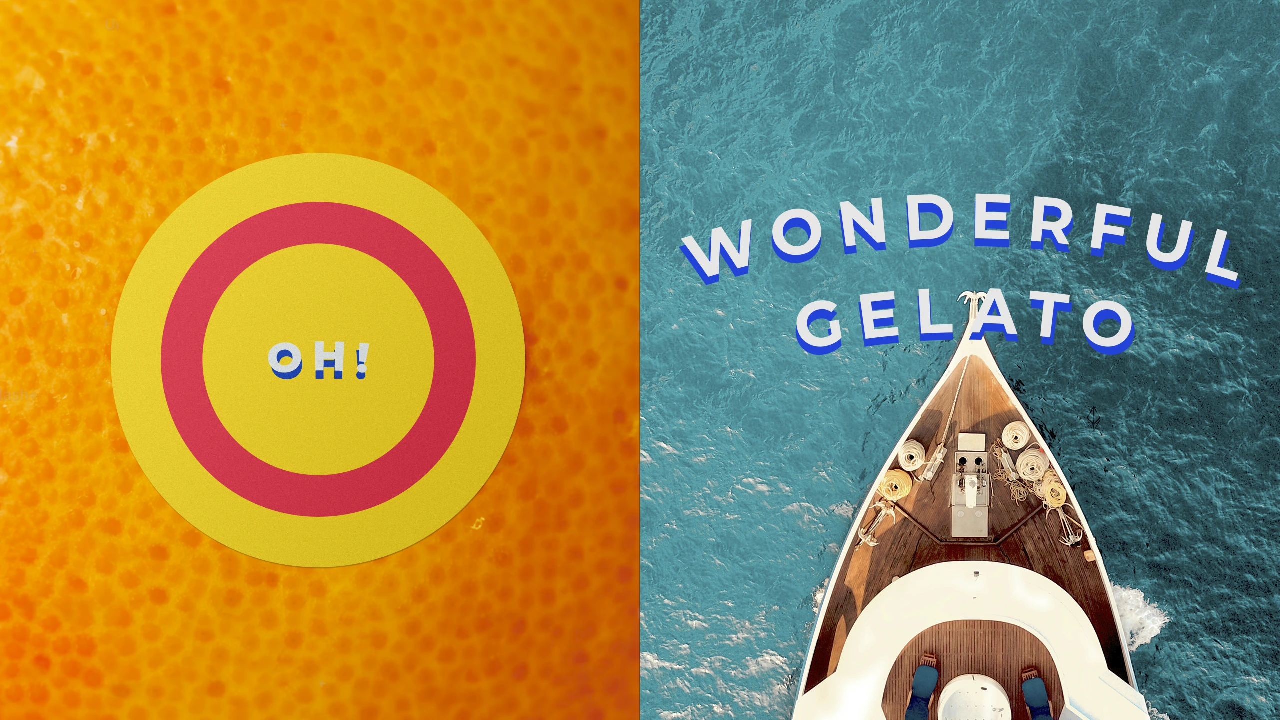
The arch form of the typography is drawn from the ‘O’ in its name, which is further extended to become an alternative brand symbol, embodying a sense of wonder – “Oh, Wonderful!”